Charts include many different visual elements, most of which are customizable. To clarify the presentation of data or to create a more pleasing composition, rearrange the chart layout. For example, change where the chart title appears or add padding between a series of bars and the axis on which they are arranged.
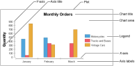
Before making changes to the layout of a chart, you must understand the parts making up a typical chart. Figure 22‑1 identifies the elements of a basic bar chart, using different background colors to highlight the following areas:
The plot containing all the parts of the chart
The chart area containing the axes, their labels and titles, and the chart
The legend containing information about the series displayed on the chart
Figure 22‑1 Elements of a chart
The color and style of these chart elements can be changed. For example, modify a chart to:
Use a company’s standard color scheme.
Outline or add a background color to the labels, legend, or plot.
Change the color and shape of the series elements, such as the sectors in a pie chart or the candlesticks in a stock chart.
Add grid lines that extend across the plot.
Add data point labels to show the exact value of bars in a bar chart.