Creating a Custom Visualization item entails inserting the Custom Visualization element in the desired location in the report, then binding the data you want to visualize. The data binding involves selecting the data columns from those available in the application data, and defining the rules for grouping, sorting, and filtering the data. In most cases, you need to aggregate the data after the grouping to create a concise summary overview of your data before presenting it in a visualization.
The Custom Visualization editor provides templates for popular third‑party visualizations. The next step is to select a visualization template, modify the selected template, and map the already bound data to the third‑party visualization component.
The template customization is different for each template and depends on the third‑party provider API. To customize the template, you need to follow the comments in the templates and replace the data markups with the column names from your data bindings. For more complex customizations, you must be familiar with the third‑party visualization API. For example, if you want to include Google Chart in your report and make more advanced customizations to it, you must be familiar with Google Chart JSAPI.
You can place a custom visualization in a report page, grid, table, list, and cross tab.
Changing a custom visualization look and feel depends on the template you choose. Some of the templates, such as heat map from Highcharts and the DataTables plug-in for the jQuery JavaScript library, support BIRT themes. For the rest of the templates, you must use the third‑party API to change the visualization appearance.
How to create a custom visualization
1 Drag a Custom Visualization element from the palette and drop it in the desired location in the report.
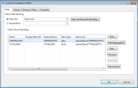
2 In Custom Visualization, select data binding. You can select data from the available reports, data sets, or report items, as shown in Figure 19‑2.
Figure 19‑2 Selecting data binding
By binding these items, the Custom Visualization item has the required information to iterate through the data rows the data set returns. This data is then passed to the third‑party visualization.
3 In Custom Visualization, choose Groups, Sorting, or Filters if you need to adjust the data. These features work in the same way as for a table report item.
You can also view the binding, grouping, sorting, and filtering on the Custom Visualization Editor page. To access this information, select the custom visualization, then choose the corresponding tab at the top of the property editor.
4 Add aggregations and set parameter bindings, if needed. For more information about using parameters, see Setting up report parameters.
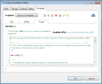
5 In Custom Visualization Editor—Template, in Select Template, choose a template, as shown in Figure 19‑3, and edit it to meet your requirements. Write JavaScript code to program the item’s behavior, if needed.
Figure 19‑3 Editing a template
The next sections provide more information about working with templates and scripting templates.
6 Choose OK. You can always reopen the Custom Visualization editor to update the code. The custom visualization appears in the report.
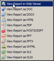
7 Run the report in the web viewer, as shown in Figure 19‑4, to test the custom visualization’s functionality.
Figure 19‑4 Choosing to view a report in Web Viewer
If you do not receive expected results, or if you receive an error, verify that the script does not contain any problems. In Layout, double-click Custom Visualization to open the script editor and update the script, if needed.