Tutorial 10: Creating a Custom Visualization template
The goal of this tutorial is to show you an integration process with third party visualizations. When going through the tutorial make a mental note of the integration points and try to apply the same approach when integrating with other providers.
This tutorial provides step-by-step instructions for building a Custom Visualization template. This template integrates a line chart using different colors for ups and downs from amCharts.com within a BIRT report. The line chart uses data from the sample database that is supplied with BIRT Designer Professional, Classic Models, Inc. The tutorial uses the amCharts’ JavaScript CHARTS Version 3.13.1. If you use a different version, the code shown in the instructions might differ from yours. In such case copy the code from the website instead from the tutorial.
In this tutorial, you perform the following tasks:
BIRT Designer Professional organizes files by projects. For each project that you create, BIRT Designer Professional creates a folder in your computer’s file system and adds default content such as a BIRTApplication.xml file and an HTML landing page. The contents of this project become the BIRT application. For this tutorial, you start with a blank report design.
1 Choose File➛New➛Project. New Project displays the types of projects that you can create. Choose Next.
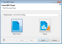
2 In New BIRT Project, select Blank Project. In Project name, type the following text, as shown in Figure 19‑25:
AmChartsVisualApp
Figure 19‑25 Creating a new project
3 To create the project, choose Finish. You can now see the project in the Navigator view.
4 Choose File➛New➛Report. New Report appears.
5 In BIRT Report Designer, in the tree view of the available folders, select the project that you created.
6 Type the following text as the file name:
AMChartsReport.rptdesign
7 Choose Next. Select Blank Report, then choose Finish. Your new report appears in the main window.
Task 2: Build a data source and a data set
For this tutorial, you use the sample database, Classic Models, Inc., which is already configured for use with BIRT Report Designer. You also build your data set, which retrieves the data for all orders from the data source.
1 Choose Data Explorer. If Data Explorer is not open, choose Window➛Show View➛Data Explorer.
2 Right-click Data Sources, then choose New Data Source from the context menu.
3 Select Classic Models Inc. Sample Database from the list of data source types. Use the default data source name, then choose Next. Connection information about the new data source appears.
4 Choose Finish. BIRT Report Designer creates a new data source that connects to the sample database. It appears within Data Sources in Data Explorer.
5 In Data Explorer, right-click Data Sets, and choose New Data Set from the context menu. Type the following text in Data Set Name:
Orders
6 Use the default values for the other fields, and choose Next.
7 In the text area, type the following SQL SELECT statement to specify the data to retrieve:
select*
from CLASSICMODELS.ORDERS
8 Choose OK.
Task 3: Add a visual component to the report
In the next few steps you add a visual component to the report and bind the component to the data you want to display. You group and aggregate the date to get the data in a format compatible with the visualization.
1 Drag a Custom Visualization element from the palette and drop it in the report. Custom Visualization Editor opens.
2 In Custom Visualization Editor—Data, select the Orders data set from the drop‑down list. The Data Set Binding list appears.
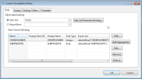
3 In Data Set Binding, select [ORDERNUMBER] and [SHIPPEDDATE] from the list of binding columns. Choose OK. The columns appear in Data Column Binding, as shown in Figure 19‑26.
Figure 19‑26 Adding data binding
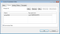
4 In Custom Visualization Editor, choose Groups, and create a group on [SHIPPEDDATE]. Set the interval to Month. Select Summarize Data, as shown in Figure 19‑27, and choose OK.
Figure 19‑27 Grouping the data
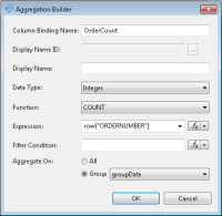
5 In Custom Visualization Editor, choose Data, and select the Add Aggregation tab. In Aggregation Builder, create an aggregation that counts the orders on each shipping date, as shown in Figure 19‑28.
Figure 19‑28 Adding an aggregation
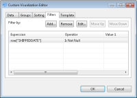
6 In Custom Visualization Editor, choose Filters. In Filters, specify a filtering condition that excludes the data rows where [SHIPPEDDATE] is null, as shown in Figure 19‑29.
Figure 19‑29 Adding a filter
Task 4: Set up amCharts
In this task you identify the implementation code from the third‑party visualization and add it to the template in the Custom Visualization report item.
In this task you integrate the line chart shown in Figure 19‑30 from http://www.amcharts.com/demos/line-different-colors-ups-downs/.
Figure 19‑30 An amCharts line chart with different colors for ups and downs
The amCharts line chart presents the count of orders for each shipping date. The chart uses different colors for ups and downs. If the previous number of orders is greater than the current number, the line will be painted in the defined color for negative lines.
The amCharts demos provide an interactive editor that you can use to modify and run the chart demos.
1 Download amCharts to your computer from the download page at:http://www.amcharts.com/download/.
2 Extract the contents of the archive to a directory of your choice.
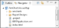
3 Copy the \amcharts directory from the downloaded ZIP file into your BIRT project, as shown in Figure 19‑31.
Figure 19‑31 Copying amCharts to a BIRT project
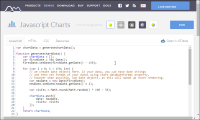
4 Open the amCharts web page at http://www.amcharts.com/demos/line‑different-colors-ups-downs/ in a web browser and choose Edit. The amCharts editor appears. The editor displays the implementation code shown in Figure 19‑32 in JavaScript, HTML, CSS, and the required scripts or libraries, in Resources.
Figure 19‑32 Locating the implementation script of the amCharts chart
5 Copy the JavaScript code from amCharts Editor—JavaScript. Paste it to Template—Script in Custom Visualization Editor, as shown in Listing 19‑8.
Listing 19‑8 amCharts JavaScript code
var chartData = generatechartData();
function generatechartData() {
var chartData = [];
var firstDate = new Date();
firstDate.setDate(firstDate.getDate() - 150);
for (var i = 0; i < 150; i++) {
// we create date objects here. In your data, you can have date strings
// and then set format of your dates using chart.dataDateFormat property,
// however when possible, use date objects, as this will speed up chart rendering.
var newDate = new Date(firstDate);
newDate.setDate(newDate.getDate() + i);
var visits = Math.round(Math.random() * 100 - 50);
6 Copy the CSS code from amCharts Editor—CSS. Paste it to Template—CSS in Custom Visualization Editor.
#chartdiv {
width:100%;
height:500px;
font-size:11px;
}
7 Copy the HTML code from amCharts Editor—HTML. Paste it to Template—HTML in Custom Visualization Editor.
<divid="chartdiv"></div>
Task 5: Load the amCharts JavaScript libraries
In this task you make the amCharts JavaScript libraries available to your BIRT application. You can load the files dynamically from the amCharts web site or load them locally from your application. The tutorial will show you how to use both approaches. You start with using a dynamic download and change it to local later.
1 In amCharts Editor, choose Resources, as shown in Figure 19‑33. The line chart you integrate requires three JavaScript libraries.
Figure 19‑33 Loading the amCharts JavaScript libraries
2 In Custom Visualization Editor—Script, add the following line at the beginning of the code to load the external JavaScript files:
The head.load(...) function loads the JavaScript files dynamically from the amCharts web site. Note that the order is important: amcharts.js should always be loaded first.
3 In Custom Visualization Editor—Script, create a callback( ) function. Add the following line of the code after the head.load(...) statement:
function callback() {
AmCharts.isReady = true;
You need to set AmCharts.isReady manually because the framework has been loaded asynchronously. Otherwise, the framework will wait for the onLoad event to confirm the loading.
4 In Custom Visualization Editor—Script, add the closing brace ( } ) for the callback( ) function at the end of the template code.
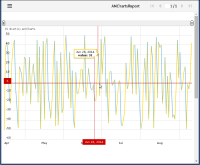
5 Preview the report in Web Viewer. You see the custom visualization presenting the amCharts line chart with the predefined data, as shown in Figure 19‑34.
Figure 19‑34 Previewing the demo amCharts line chart
6 In Custom Visualization Editor—Script, change the head.load(...) call to load the amCharts libraries locally from your application.
You use getBirtResourceURL(...) to obtain the relative URL to the provided file.
Task 6: Load BIRT data in amCharts
In this task you modify the generatechartData( ) function in the amCharts template to load the data from the BIRT report data set.
1 In Custom Visualization Editor—Script, add the following line after the head.load(...) statement:
var cursor = this.getDataCursor();
This method returns an object that supports the hasNext( ) and next( ) methods, to allow browsing through the Custom Visualization data.
2 In Custom Visualization Editor—Script, modify the generatechartData( ) function to map the binding to the Custom Visualization item data. Your function should look like this:
function generatechartData() {
var chartData = [];
while(cursor.hasNext()) {
var row = cursor.next();
chartData.push({
date: row["SHIPPEDDATE"],
visits: row["OrderCount"] });
}
return chartData;
}
3 In Custom Visualization Editor—Script, choose OK to save the modifications.
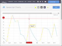
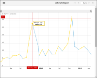
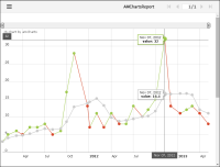
4 In BIRT Designer, choose View Report. The report appears as shown in Figure 19‑35.
Figure 19‑35 Viewing the line chart with BIRT data
5 In Custom Visualization Editor—Script, modify the amCharts properties to change the chart appearance. In this step you make the following changes:
Change the color of the positive line from yellow to #9ecc4c.
Change the color of the negative line from blue to #db462e.
Change the color of the scrolling cursor from red to dark gray #555555.
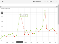
6 Preview the chart in Web Viewer. The chart appears as shown in Figure 19‑36.
Figure 19‑36 Modifying the chart appearance
Task 7: Add a moving average to the chart
In this task you calculate the average number of orders per shipping date and add a moving average line to the chart.
1 In Custom Visualization Editor—Script, add the addMovingAvg(...) function, shown in Listing 19‑10, between the generateChartData( ) function code, and the var chart definition.
Listing 19‑10 addMovingAvg( chartdata, steps )
function addMovingAvg(chartData, steps) {
var sum = 0;
for (var i = 0; i < chartData.length; i++) {
sum += chartData[i].visits;
if (i - steps < 0) {
chartData[i].avg = sum / (i + 1);
} else {
sum -= chartData[i - steps].visits;
chartData[i].avg = sum / steps;
}
}
return chartData;
}
As the amCharts line chart requires, the chartData[ ] array consists of two elements, date and visits. The code in Listing 19‑10 adds another element to the array, avg. The function parameter, steps, defines the range for calculating the average.
2 In Custom Visualization Editor—Script, add the call to the addMovingAvg(...) function at the beginning of the callback function, as follows:
function callback() {
AmCharts.isReady = true;
var chartData = generatechartData();
addMovingAvg(chartData, 5);
3 In Custom Visualization Editor—Script, add the formatting for the moving average line to the graph definitions, as follows: