To enable interactive filtering, add data selection gadgets. Data selection gadgets display unique values in a data set, data cube, or data model. These gadgets enable users to select and search for data to display on the dashboard.
Link other gadgets to a data selection gadget to use the selected value as a filter of the displayed data or to process the value with JavaScript code. For example, link a chart gadget to a data selection gadget showing customer names. When the user selects a customer name in the data selection gadget, the chart updates to show the values related to the selected customer.
The following data selection gadgets are available:
Calendar
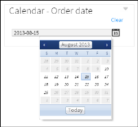
Calendar gadgets display dates from a data object as a calendar, where a user can select day, month, or year. You can set a start and end date to limit user selection to a specific time period. Calendar gadgets do not require a BIRT data object to display choices to the user. You can choose default dates when you create the calendar gadget. Figure 17‑37 shows a calendar gadget.
Figure 17‑37 Displaying dates in a calendar gadget
Check box
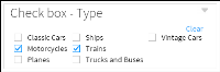
Check box gadgets display values from a data object with a check box next to each value. Users can select multiple values. Figure 17‑38 shows a check box gadget.
Figure 17‑38 Displaying data in a check box gadget
Combo box
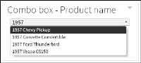
Combo box gadgets display values from a data object in a drop‑down box. This gadget supports manual typing and autosuggestion of values. Figure 17‑39 shows a combo box gadget.
Figure 17‑39 Displaying data in a combo box gadget
Data version
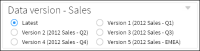
Data version gadgets display available versions of BIRT data stores for a user to choose. Changing a data store version causes gadgets to display values from the selected data store. Figure 17‑40 shows a data version gadget.
Figure 17‑40 Displaying versions of a data store file in a data version gadget
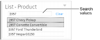
List
List gadgets display data object values in rows. Users can search and select multiple values. Press Ctrl while selecting multiple non‑adjacent values. Press Shift while selecting multiple adjacent values. Figure 17‑41 shows a list gadget.
Figure 17‑41 Displaying data in a list gadget
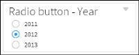
Radio button
Radio button gadgets display values from a data object with a radio button next to each value. Users can select a single value to include. Figure 17‑42 shows a radio button gadget.
Figure 17‑42 Displaying data in a radio button gadget
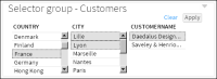
Selector group
Selector group gadgets enable users to select cascading values from multiple fields and apply all their selected values at the same time. Each selection filters the values displayed in the next field. Figure 17‑43 shows a selector group gadget.
Figure 17‑43 Displaying data in a selector group gadget
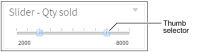
Slider
Slider gadgets display a range of values from a data object as a sliding bar with tick marks next to known values. This gadget supports single and dual selections using thumb selectors. Sliders do not require a BIRT data object to display choices to the user. You can choose default values when you create the slider. Figure 17‑44 shows a slider gadget.
Figure 17‑44 Displaying data in a slider gadget
Multiple data selection gadgets can link to each other to enable users to select cascading information. For example, a list gadget showing customer names and a list gadget showing order numbers can link together. When a user selects a customer name, the order numbers from the selected customer appear in the list gadget showing order numbers.
You can also link a report gadget to a data selection gadget if the displayed report uses parameter values. For more information about linking options, see Linking and scripting gadgets.
How to create a data selection gadget
This procedure requires a dashboard you can edit. Create a new dashboard if one does not already exist. To add a data selection gadget, complete these steps:
1 In the dashboard editor, select Insert➛Data Selector, and choose a data selection gadget type. In this example, choose Insert➛Data Selector➛List.
2 Select the data to display in the data selection gadget by completing the following steps:
1 In Data Selector Gadget Wizard—Data—Use Data, select a data source. If no data source appears, choose New Data to select a BIRT data object from available data objects in the BIRT project.
2 In Field, select a data column to display in the data selection gadget.
3 In Display field, select a data column to display in the data selection gadget if it is different from the Field value.
4 In Sort direction, choose None, Ascending, or Descending to sort the data in the gadget.
3 The following optional tasks are available when you create the data selection gadget or after the gadget is added to the dashboard:
Specify gadget appearance, such as title and gadget size, in Data Selector Gadget Wizard—General. Display a border, header, and menu icon.
Limit displayed data with filter conditions in Data Selector Gadget Wizard—Filter.
Format the cross tab in Data Selector Gadget Wizard—Format. Each data selection gadget has different formatting options. For example, in a list gadget you can set a default value, limit the entries in the list, enable multiple value selections, enable search, and format the values that appear in the list.
4 Choose OK to create the new data selection gadget.
Enable interactive filtering by linking other gadgets to the data selection gadget. After the data selection gadget is placed on the dashboard, it links to gadgets that use the same data source. You can remove these links or add new ones.
Displaying data for user selection
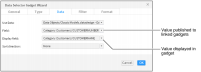
A data selection gadget displays values from a BIRT data object. When you add or edit a data selection gadget, you select data to display. Choose a BIRT data object and select a data set, data cube, or data model. Next, select the name of a data column to display in the data selection gadget. When you create a data selection gadget, you can choose a default value. This value appears when the dashboard is opened.
You can display a different value than what is published to the dashboard. This can link different data sources together on the dashboard. For example, you add a list gadget to display customer names from a client database. Next, set the list to publish the customer’s account number instead of the customer’s name. A report gadget displays orders from a sales database and links to the list gadget. When the user selects a customer name, the report gadget runs a report using the customer’s account number and displays the customer’s order history.
Figure 17‑45 shows the data source setting for a list gadget that displays a list of customer names but sends the customer number when a name is selected.
Figure 17‑45 Selecting data to display in a list gadget
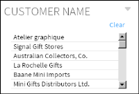
Figure 17‑46 shows the finished list gadget on the dashboard.
Figure 17‑46 Reviewing values in a list gadget
Formatting data selection gadgets
Each gadget type includes different formatting options to assist users in finding and selecting values. You can format the displayed data values, set default values, select a vertical or horizontal orientation, and limit the displayed values.
A combo box gadget supports autosuggest and allows typing options that can assist users to type partial values and find possible value matches. For example, when the allow typing and autosuggest options are enabled, a user can type the letters po in a combo box displaying countries. The values Poland and Portugal appear for the user to select from because both values start with the letters po.
A list gadget supports multi-value selections and searching for values in the gadget.
Formatting number values
Using Format as, you can change the look of displayed values. Number values support the following formatting options: general number, currency, fixed, percent, scientific, and custom options.
Formatting date-and-time values
You can display date-and-time values in different formats such as short, medium, long, and custom formats.
Formatting string values
String values support uppercase, lowercase, and custom formatting options.
Using a data version gadget
Data version gadgets display the version number and version name of multiple BIRT data object store files for a user to select. When a user selects one of the versions, gadgets displaying values from the same BIRT data object store file display values from the selected version of the BIRT data object.
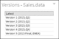
For example, a dashboard displays sales results in a chart and table from a data object of this year’s sales data. When the user selects last year’s data object in the data version gadget, the dashboard displays the data from last year in the chart and table. Figure 17‑47 shows a finished data version gadget on the dashboard.
Figure 17‑47 Displaying versions of a data store file as a list
Multiple versions of the same data object are supported only on an iHub server.
Selecting a data object
When you select a BIRT data object store file to display in a data version gadget, the version number and version name of each version of that file appears in the data version gadget. For example, if you choose to display the data store file Sales.data in a data version gadget, all versions of the Sales.data file are displayed in the data version gadget.
Choosing a selector type
You can display data version gadgets in combo box or list types using Data Selector Gadget Wizard. Choose Type to select how the data version gadget is displayed.
Formatting a data version gadget
When a data version gadget displays radio buttons, you can format the content of the gadget. Select the number of choices per row and whether the gadget displays choices in a horizontal or a vertical display. You can also limit how many different versions are displayed.
 Calendar