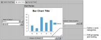
When the expression returns too many categories to fit on the x-axis, on the meter, or in a pie, you need to use the grouping functionality in the chart builder, as shown in Figure 21‑9.
Figure 21‑9 Defining x-axis categories and grouping and sorting
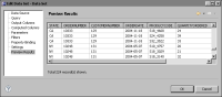
You can group text, numeric, or date-and-time data. The Classic Models, Inc. database includes all of these data types, as shown in Figure 21‑10.
Figure 21‑10 Previewing data types in the Classic Models, Inc. database
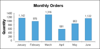
Plotting every order across the x-axis creates so many bars that a user cannot read the values in the chart. To plot order information more clearly in a bar chart, group categories that appear on the x-axis by month, as shown in Figure 21‑11.
Figure 21‑11 X-axis categories grouped by month
How to group categories on the x-axis
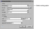
1 In the chart builder, in Select Data, choose Edit Group and Sorting. Figure 21‑9 shows the location of Edit Group and Sorting.
2 In Data Sorting, select either Ascending or Descending.
3 In Sort On, type or select a value.
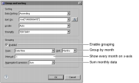
4 In Grouping, select Enabled to see the grouping options shown in Figure 21‑12.
Figure 21‑12 Grouping category data by month
5 Use the following options to set up a group:
In Type, select Text, Numeric, or DateTime. If you select DateTime, you can specify the units to use to form the groups, such as Months.
In Interval, select a number that represents the size of the groups to create. For example, to group three-row sequences of text data, select 3. To group numeric data in sections of four, select 4.
In Aggregate Expression, select the function to use to aggregate the data in the group. You can select Average, Sum, Count, Distinct Count, First, Last, Minimum, and Maximum.
Grouping date-and-time data
You can group date-and-time data by seconds, hours, minutes, days, weeks, months, or years. Use the interval option to perform selective plotting of group members. For example, to plot data for every other month, use an interval of 2.
Grouping textual data
You group textual data using an interval. The interval determines how many rows compose each group. For example, if you use an interval of 20, each group contains 20 rows of text from the database.
Grouping numeric data
You group numeric data by specifying the rows of data that compose the group. The chart builder uses a default interval of 0.5 to create numeric groups. If you change the setting to 20, the first group contains rows with values between 1 and 20, the second group contains rows with values between 21 and 40, and so on. If the chart does not include a value in a group section, that section does not appear in the report. If you group order numbers 150–300 using a value of 20, the first group section that appears in the chart is 141–160.
For example, Table 21‑2 displays budget data for three cities.
Table 21‑2 Data for a chart that uses category series grouping
Year
City
Budget
2008
Los Angeles
3485398
2008
Chicago
2783726
2008
New York
7322564
2009
Los Angeles
4694820
2009
Chicago
3196016
2009
New York
8008278
2010
Los Angeles
6819951
2010
Chicago
2569121
2010
New York
8085742
To group data using the Year field, you enable grouping, specify the data type of the field, and define a grouping interval. The data type that you select determines how the chart builder creates the groups as follows:
If Year is a text field, selecting an interval value of 3 creates three groups. The first group includes the first three rows in the table, the second group contains rows four through six, and the third group contains the last three rows.
When you group text values, you must use a regular grouping interval. You cannot create groups of varied sizes or use a field value to create a group. To create sensible groups in the chart, you must arrange the data in your data source before you create the chart. To use more complicated grouping, you should use your query to group data, then you can use those grouped values in the chart.
If Year is a numeric field, selecting an interval value of 3 creates two groups. The first group includes the 2008 rows, because grouping by three from a base value of 1 creates one group that ends with 2008. The second group contains the 2009 and 2010 rows.
After you define how to create the groups, you must select an aggregate function that determines how the chart builder combines the values in each group.
Sorting category data
The category values appear in the chart in the order that the query returns them. You can sort the data so that it appears in a different order on an axis, in a dial, or in a pie. For example, you can show cities along the x-axis in alphabetical order. Similarly, you can show customer ranks in descending numeric order around a pie. Charts support sorting data in an ascending or a descending order. To sort data, in Select Data, choose Edit Group and Sorting. In Data Sorting, select Ascending or Descending, as shown in Figure 21‑13.
Figure 21‑13 Selecting a sorting option and enabling grouping