A report can often be more effective when it highlights and reinforces key information. A common design technique is to present key data in both graphical and textual formats. Compare the reports in Figure 25‑1.
Figure 25‑1 Comparison of reports displaying summary data in different formats
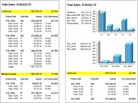
The report on the left shows the first page of a report that displays detailed sales data. Totals and percentages for each state are displayed prominently in each state group header, but it is difficult to compare the aggregate data among the states because the data appears on multiple pages.
The report on the right shows the same detailed sales data, and adds summary tables and charts to highlight the aggregate data. The summary tables and charts provide summary versions of the same sales data. Notice that each summary table and chart next to it show identical data. As this report illustrates, presenting different views of the same data draws attention to key information and also makes the report more compelling visually.
This section discusses the different ways for report elements to share and display the same data, and provides tips and examples for building a dashboard report, a type of report that exemplifies data sharing among report elements.