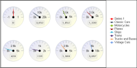
A meter chart displays a value as a needle pointer on a semicircle, called a dial. As
Figure 9‑4 shows, a meter chart resembles a speedometer, with tick marks and numbers showing a range of values. A meter chart supports standard and superimposed subtypes.
The standard meter chart typically creates a dashboard effect. A standard meter chart displays multiple values in multiple dials, where each dial displays a single value, as shown in the chart in
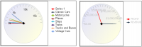
Figure 9‑4. The chart in this example displays quantities ordered by product line. A superimposed meter chart displays multiple values in a single dial, as shown in the chart on the right in
Figure 9‑5, which shows pointers that represent two distinct values: profit and revenue totals for each territory. Use the superimposed meter chart type when there are few values to display and when each value is distinct. Duplicate values result in overlapping needles, as shown in the superimposed meter chart on the left in
Figure 9‑5. In this chart, it is not easy to view the individual quantities ordered for each product line.