A scatter chart presents data as x‑y coordinates by displaying two sets of numeric values as single data points. A scatter chart typically is used to display scientific and statistical data, because it shows if there is a relationship between two sets of measurements. For example, use a scatter chart to compare salaries and years of experience or weight and body fat. The more data values you include in a scatter chart, the clearer the trends the data reveals.
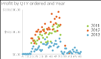
The scatter chart in Figure 9‑8 shows the relationship between quantity ordered and profit over three years. Each pair of values, quantity ordered and profit, is plotted as a single x‑y value.