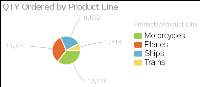
A pie chart is a circular chart that is divided into sectors or slices. Each sector represents a value that is proportional to the sum of the values. Use a pie chart to show the relationship of parts to the whole, for example, the order quantity each product line contributes to the total, as shown in
Figure 8‑6.
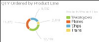
Doughnut charts are similar to pie charts. These are ring charts in the form of segments. Each segment represent a value that is proportional to the total value, as shown in
Figure 8‑7.