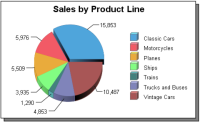
A pie chart shows the relationships of parts to the whole. The shading and colors of sectors in a pie chart support straightforward comparison of values. For example, the chart in
Figure 20‑6 shows the percentage revenue for multiple product lines. In this example, the size of the sectors for the 6 product lines ranges from approximately 2.6 percent to 33 percent of total revenue.