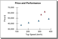
A scatter chart shows data as points. Scatter charts display values on both axes. For example, the chart in
Figure 20‑7 compares two sets of numerical data for certain sports cars: the top speed and the price. You can see from the chart how performance increases in relation to price.