Most charts have horizontal and vertical axes, called the x-axis and y-axis. These axes usually display the following types of values:
Category series
A set of values that lie on the x-axis. Category series can be of any data type.
Value series
A set of values that lie on the y-axis. A value series can be of the numeric, date, or date-and-time data type, depending on the chart type.
Generally, a chart displays a single category on the x-axis, and one or more value series on the y-axes. An axis displays additional value series or group values for a category series parallel to the x-axis. The series that is parallel to the x-axis often appears in depth or three dimensions. Certain charts, such as pie and meter charts, do not have any axes.
About the axes
Typically, you plot text or date-and-time data on the category (x) axis, which has regular segments that do not correspond to numerical values. If there are too many categories to fit within the finite limitations of the chart, you can use grouping. For example, group sales by quarter. By default, category values appear in the same order as they occur in the data source, unless sorted in another order by the query. You can sort the values in ascending or descending order using Edit Group and Sorting.
Typically, you plot numeric or date-and-time data on a value (y) axis. A value axis does not support plotting text data. A value axis positions data relative to the axis marks. The value of a data point determines where it appears on a value axis. Like data on the category axis, you can group and sort data on the value axis. Value series grouping defines sets of values.
Defining the axes
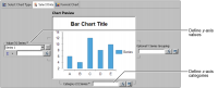
After you select the data set, you define how the chart builder uses data from the data set to plot the chart. The options you use in the upper half of the Select Data page, shown in Figure 21‑4, define the axes.
Figure 21‑4 Defining axes values in Select Data
Plotting different chart types
In the Select Data page, the Category (X) Series, or Category Definition, option plots data on the x-axis. The value series option plots data on the y‑axis. The options differ slightly in name and function, depending on the chart type. For example, when you create a meter chart, which has no axes, you define the position of a needle on the dial instead of defining a y-axis. When you create a pie chart, you define the size of the slices instead of the y‑axis. Table 21‑1 describes the differences in plotting options in the Select Data page for chart types.
Table 21‑1 Differences in x- and y-axis plotting options for chart types
Chart type
Option name
Description
Area, bar, cone, difference, line, pyramid
Category (X) Series
Arranges data on x-axis. Can group, sort, and aggregate data.
Value (Y) Series
Plots values on y-axis.
Bubble
Category (X) Series
Plots values on the x-axis. Can group, sort, and aggregate data.
Y Value and Size
Plots values on y-axis and defines the size of the bubbles.
Defines values of the dial and position of the needle.
Pie
Category Definition
Defines what slices represent.
Slice Size Definition
Defines size of sectors. Creates multiple pies.
Scatter
Category (X) Series
Plots markers along x-axis. Groups data along x‑axis.
Value (Y) Series
Defines intersection of (x-y) value pairs. Defines multiple (x-y) value pairs.
Stock
Category (X) Series
Plots values along x-axis.
Value (Y) Series
Defines four levels of data: high, low, open, close. Defines multiple sets of candlesticks.
Plotting the x- and y-axes
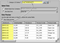
You can drag and drop the data columns from Data Preview to the category and value definition areas to plot the axes. The chart builder writes expressions for creating visual chart elements based on the data columns you drag and drop. You can then enhance the expressions to plot computed or filtered data. For example, you plot dates along the x-axis by dragging and dropping the ORDERDATE column from the data preview to Category (X) Series, as shown in Figure 21‑5.
Figure 21‑5 Defining the x-axis expression
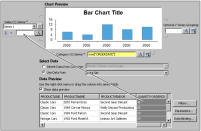
You can specify that the chart builder plot X-Y data points using one column of data, such as order quantity, multiplied by another column, such as price. You plot these data points by first dragging and dropping the order quantity column from Data Preview to Value (Y) Series, as shown in Figure 21‑6.
Figure 21‑6 Defining the y-axis expression
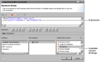
Next, open the expression builder to enhance the expression, as shown in Figure 21‑7.
Figure 21‑7 Opening the expression builder
Using the expression builder, as described earlier in this book, you can view and select the available column bindings to add code for the bindings to your expression. You can also add operators, JavaScript functions, and BIRT functions.
You need to type the portions of the following expression that you cannot drag and drop. For example, the first line of the following expression applies a filter to the query of the Classic Models, Inc. database to return only classic car data. The second line computes the revenue for each order.
if(row["PRODUCTLINE"] == "Classic Cars"){
row["QUANTITYORDERED"] * row["PRICEEACH"]}
Using this expression to define the Value (Y) Series expression plots data points using order quantities times price.
Figure 21‑8 shows the expression builder and available column bindings.