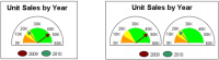
A meter chart shows a data value as a needle that marks a position on a dial. You can create a chart that shows one or more needles on one dial or one that shows multiple dials, each displaying one needle. It is not possible to use multiple needles on multiple dials. Figure 21‑35 shows two sample meter charts.
Figure 21‑35 Meter charts using one and two meters
The meter value series specifies the needle value. The chosen expression determines where on the dial the needle appears. To show multiple needles or meters, use either multiple meter value series expressions or Optional Grouping.
A category definition is not essential to a meter chart. You must, however, provide an expression in the Category Definition field. You can type a space that is enclosed by quotation marks in this field to satisfy this requirement. The chart selects the first row returned by the meter value definition and uses the data from that row in the chart.
Using multiple meters in a chart
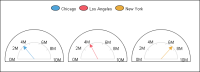
The meter value definition specifies the dial values and position of the needle. To show multiple meters, use either multiple meter value definitions or grouping. For example, Figure 21‑36 is a standard meter chart. Standard meter charts use only one needle for each meter. The chart uses population as the needle value and city as a grouping field. Because the chart builder requires a value in the category field, provide a string containing a single space, " ", for the Category Definition.
Figure 21‑36 Meter chart that uses multiple meters
Table 21‑8 Data for a meter chart that uses grouping
City
Population
Chicago
2783726
Los Angeles
3485398
New York
7322564
The chart builder uses the expressions to position the needles and plot each population value as the position of a needle on the dial. The chart builder uses the values to position the dials, one for each meter, in the chart. The grouping sets up a meter for each city. The legend identifies the meters.
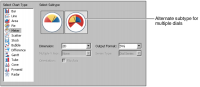
Using multiple dials in a chart
To show multiple dials, select the alternate subtype when you choose the chart type, as shown in Figure 21‑37.
Figure 21‑37 Selecting the subtype, meter chart, which uses multiple dials
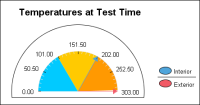
You can also use multiple series definitions to create multiple meters or a meter with multiple needles. For example, the chart in Figure 21‑38 is a superimposed meter chart that shows multiple needles in one meter. One needle shows the interior temperature, 201. The other needle shows the exterior temperature, 303.
Figure 21‑38 Superimposed meter chart
The first meter value series expression is row["InteriorTemp"]. The second meter value series expression is row["ExteriorTemp"]. The chart does not use Optional Grouping. The Category Definition is a string containing a single space, " ".
To provide more than one meter value series expression, use the meter value series drop-down list. Select New Series, then use the expression field to supply the series expression. After adding one or more series, use the drop‑down list to navigate among the meter value series definitions.