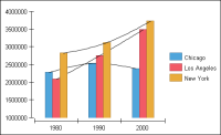
A curve-fitting line is a graphical representation of a trend in data. Use a curve‑fitting line to detect patterns in data or to predict future values. For example, the chart in Figure 22‑110 uses curve-fitting lines to highlight population trends in several cities. Use the trend lines to estimate population in the years after 2000. The population for Los Angeles, for example, is growing sharply, while the population in New York has increased less dramatically.
Figure 22‑110 Chart using curve-fitting lines
You use curve-fitting lines in both two-dimensional and two‑dimensional with depth area, bar, bubble, line, scatter, and stock charts. You cannot use curve fitting with a three-dimensional chart. A curve-fitting line in a BIRT chart places each curve-fitting point based on the following factors:
The location of the neighboring data points
A weight function that takes into account all the data points that the curve‑fitting line includes
A curve-fitting line can look very different depending on the span and amount of data that you use. Before adding curve fitting to your chart, ensure you have enough data to show a meaningful trend.
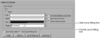
To display a curve-fitting line, navigate to the Value Series section of Format Chart, then select Show Curve Fitting Line, as shown in Figure 22‑111. By default, a curve-fitting line uses a thin black line. You can change the line style or color.
Figure 22‑111 Show curve-fitting line option
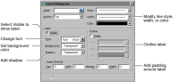
To format a curve-fitting line, navigate to the Value Series section of Format Chart, and choose Curve Fitting Line, then use the settings to change the style, width, or color of the line, as shown in Figure 22‑112.
Figure 22‑112 Labeling and formatting options for a curve-fitting line
To add labels to a curve-fitting line, navigate to the Value Series section of Format Chart, and choose Curve Fitting Line. In Label, select Visible, then use the settings on Curve Fitting Line to format the labels, as shown in Figure 22‑112.