Tutorial 8: Creating a Google Map from Google Charts
The Google Map Chart displays a map using the Google Maps API. Data values are displayed as markers on the map, and can be coordinates or addresses. The map is scaled so that it includes all the identified points. When you select a marker, a tooltip displays the name and population of the country.
The example in this tutorial uses data from the sample database, Classic Models, Inc., and displays a map where the customers are located, along with the number of customers per country.
In BIRT Designer Professional, create a project and a blank report.
1 Choose File➛New➛Project. New Project displays the types of projects that you can create. Choose Next, and then choose Finish. You can now see the project in the Navigator view.
2 Choose File➛New➛Report. New Report appears. Type the following text as the file name:
GoogleMap.rptdesign
3 Choose Next. Select Blank Report, then choose Finish. Your new report appears in the main window.
Task 2: Build a data source and a data set
The tutorial uses the sample database, Classic Models, Inc., which is already configured for use with Actuate BIRT Designer.
1 Choose Data Explorer. Select Classic Models Inc. Sample Database from the list of data source types. Use the default data source name, then choose Next. Connection information about the new data source appears.
2 Choose Finish. BIRT Report Designer creates a new data source that connects to the sample database. The new data source appears within Data Sources in Data Explorer.
3 In Data Explorer, right-click Data Sets. In New Data Set, in Data Set Name, type the following text:
Customers
4 Use the default values for the other fields, and choose Next.
5 In the text area, type the following SQL SELECT statement to specify the data to retrieve. Choose Finish, and then choose OK:
select CLASSICMODELS.CUSTOMERS.CUSTOMERNUMBER,
CLASSICMODELS.CUSTOMERS.COUNTRY
from CLASSICMODELS.CUSTOMERS
Task 3: Add a visual component to the report
In the next few steps you add a visual component to the report and bind the component to the data you want to display.
1 Drag a Custom Visualization element from the palette and drop it in the report. Custom Visualization Editor opens.
2 In Custom Visualization Editor—Data, select the Customers data set from the drop-down list. The Data Set Binding list appears.
3 In Data Set Binding, select [COUNTRY] and [CUSTOMERNUMBER] from the list of binding columns. Choose OK. The columns appear in Data Column Binding.
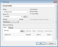
4 In Custom Visualization Editor, choose Groups. Select Add to create a group on [COUNTRY], as shown in Figure 19‑7. Choose OK.
Figure 19‑7 Creating the country‑group group
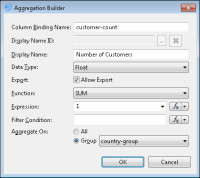
5 In Custom Visualization Editor, choose Data, and select the Add Aggregation tab. In Aggregation Builder, create an aggregation that counts the customers per country, as shown in Figure 19‑8. Choose OK.
Figure 19‑8 Adding the customer-count aggregation
6 In Custom Visualization Editor—Template, from the Template drop-down list, choose the Google Map from Google Charts template. The template script appears in the template editor. Choose OK.
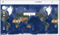
7 In BIRT Designer Professional, select View Report in Web Viewer. Google Map appears, as shown in Figure 19‑9, showing the sample data, hard-coded in the template.
Figure 19‑9 Viewing a Google Map template
Task 4: Customize the template to map the data
In this task you modify the template to map the data you bound to the Custom Visualization item.
1 In Custom Visualization Editor—Template, locate the following line:
var config = {
2 Modify the locationColumn and labelColumn definitions to the following:
locationColumn : "COUNTRY",
labelColumn : "customer-count"
Choose OK, and preview the application in Web Viewer. The map appears as shown in Figure 19‑10. You can zoom in and out, and click a flag to see the tooltip display the number of customers.
Displaying only the number of customers in the tooltip is not sufficient information. In the next step you modify the label to display the country name as well. The best place to do this is in the dataTransform(...) function. This function transforms the visualization component’s data to the Google Map data structure.
Figure 19‑10 Previewing the Customers map
3 In Custom Visualization Editor—Template, locate the dataTransform(cursor) function shown in Listing 19‑3.
Listing 19‑3 The dataTransform(cursor) function
function dataTransfrom(cursor) {
var rows = [];
while (cursor.hasNext()) {
var rowData = cursor.next();
var row = [];
row.push(String(rowData[config.locationColumn]));
row.push(String(rowData[config.labelColumn]));
rows.push(row);
}
return rows;
}
The function uses Actuate JavaScript API to loop through the data set.
4 In the dataTransform(cursor) function, modify the following line:
The code concatenates the country name to the number of customers.
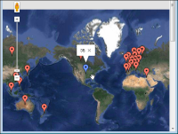
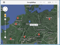
5 Choose OK, and preview the report in Web Viewer. Figure 19‑11 displays the customers in Europe.
Figure 19‑11 Previewing the customers in Europe
6 Locate Germany on the map and hover the mouse over the tag. The tooltip shows the number of the customers in Germany. To get this view, zoom in to get a closer view of Europe.
Task 5: Debug the template
Modifying JavaScript code requires debugging. You can debug the Custom Visualization templates using JSFiddle, or using the web browser’s debugging tools. In this step you add debug outputs in the JavaScript code to view the data.
This tutorial uses Google Chrome as the default web browser. The instructions in this task related to the browser debugging apply only to Chrome. You can debug in a similar manner in Firefox and IE browsers.
1 In BIRT Designer Professional—Layout, select the Custom Visualization item.
2 Choose Script. In Script, select clientOnCreate event from the drop-down list. The template code appears.
3 Add the following line above the config array definition:
console.log(this.getData());
var config = {
...
This statement prints the visualization component data array to the browser console.
4 Preview the report in Web Viewer. The report appears in the browser.
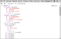
5 In Chrome, press F12 to start debug mode and choose Console to see the debug outputs. The console, shown in Figure 19‑12, displays the bound data in the Custom Visualization item.
Figure 19‑12 Debugging data in a Google Map
The data object contains three arrays: columns, labels, and rows. Using this information, you can validate the bound report item data.
6 In BIRT Designer Professional—Script, locate the dataTransform(...) function, and add, as shown in Listing 19‑4, the following statement:
console.log(rows);
Listing 19‑4 Adding a debug output in the dataTransform(...) function
7 Preview the report in Web Viewer. The report appears in the browser.
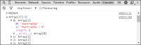
8 In Chrome, press F12 to start debug mode, and choose Console to see the debug outputs. The console, as shown in Figure 19‑13, displays the data rows passed to the Google Map visualization.
Figure 19‑13 Debugging the data after the transformation