Tutorial 9: Creating a multilevel pie chart from FusionCharts
Multilevel pie charts are a set of concentric circles that are used to visualize hierarchical relationships. The size of each item represents its contribution to the inner parent category. The chart starts with a single item that is depicted as a circle in the center. This is the root node. A concentric ring is set around this central circle to see the breakup of that item. The concentric ring is then segmented to show how various child items have contributed to the parent item.
This tutorial provides instructions for creating a multilevel pie chart from FusionCharts. The tutorial shows a basic report design that accesses the Classic Models, Inc. sample database. In this tutorial, you present information about the number of customers the sales representatives in the company are responsible for. The pie chart also displays the customer distribution per employee, city, and country.
In this tutorial, you perform the following tasks:
In this task you open BIRT Designer Professional, and create a project and a blank report.
1 Choose File➛New➛Project. New Project displays the types of projects that you can create. Choose Next, and then choose Finish. You can now see the project in the Navigator view.
2 Choose File➛New➛Report. New Report appears. Type the following text as the file name:
Multi-level-pie-chart.rptdesign
3 Choose Next. Select Blank Report, then choose Finish. Your new report appears in the main window.
Task 2: Build a data source and a data set
The tutorial uses the sample database, Classic Models, Inc., which is already configured for use with Actuate BIRT Designer Professional.
1 Choose Data Explorer. Select Classic Models Inc. Sample Database from the list of data source types. Use the default data source name, then choose Next. Connection information about the new data source appears.
2 Choose Finish. BIRT Report Designer creates a new data source that connects to the sample database. It appears within Data Sources in Data Explorer.
3 In Data Explorer, right-click Data Sets. In New Data Set, in Data Set Name, type the following text:
EmployeeByLocation
4 Use the default values for the other fields, and choose Next.
5 In the text area, type the following SQL SELECT statement to specify the data to retrieve, and choose OK:
select CLASSICMODELS.OFFICES.COUNTRY,
CLASSICMODELS.OFFICES.CITY,
CLASSICMODELS.EMPLOYEES.LASTNAME,
CLASSICMODELS.EMPLOYEES.FIRSTNAME,
CLASSICMODELS.CUSTOMERS.CUSTOMERNUMBER
from CLASSICMODELS.OFFICES,
CLASSICMODELS.EMPLOYEES,
CLASSICMODELS.CUSTOMERS
where CLASSICMODELS.OFFICES.OFFICECODE =CLASSICMODELS.EMPLOYEES.OFFICECODE
and CLASSICMODELS.EMPLOYEES.EMPLOYEENUMBER
=CLASSICMODELS.CUSTOMERS.SALESREPEMPLOYEENUMBER
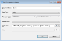
6 In Data Set, choose Computed Columns, then New to create a computed column Name, as shown in Figure 19‑14.
Figure 19‑14 Creating a computed column, Name
7 In Expression, type, or use the expression builder to build, the following expression:
The expression concatenates the first letter from the employee’s first name to the last name.
8 In Edit Computed Column, choose OK. In Data Set, choose OK to finish the setup.
Task 3: Bind the data to the visual component
In this task, you add a visual component to the report and bind the component to the data you want to display.
1 Drag a Custom Visualization element from the palette and drop it in the report. Custom Visualization Editor opens.
2 In Custom Visualization Editor—Data, select the EmployeeByLocation data set from the drop-down list. The Data Set Binding list appears.
3 In Data Set Binding, select [COUNTRY] and [CITY], [Name], and [CUSTOMERNUMBER] from the list of binding columns. Choose OK. The columns appear in Data Column Binding.
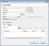
4 In Custom Visualization Editor, choose Groups, and create a group on [Name], as shown in Figure 19‑15. Choose OK.
Figure 19‑15 Creating a group on [Name]
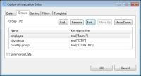
5 In Custom Visualization Editor—Groups, add groups on [CITY] and [COUNTRY]. Choose OK. The groups appear, as shown in Figure 19‑16.
Figure 19‑16 Adding groups on [CITY] and [COUNTRY]
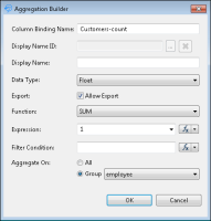
6 In Custom Visualization Editor, choose Data, and select the Add Aggregation tab. In Aggregation Builder, create an aggregation that counts the customers for each employee, as shown in Figure 19‑17. Choose OK.
Figure 19‑17 Adding the empl-count aggregation
7 In Custom Visualization Editor—Template, from the Template drop-down list, choose Multi-Level Pie Chart from FusionCharts. The template script appears in the template editor. Choose OK.
8 In BIRT Designer, select View Report in Web Viewer. Multi-Level Pie Chart appears, as shown in Figure 19‑18, showing the example data, hard-coded in the template.
Figure 19‑18 Previewing the Multi-Level Pie Chart template
Task 4: Modify the template to map the data
In this task you modify the template to map the data you bound to the Custom Visualization item.
1 In Custom Visualization Editor—Template, locate the following line:
var config = {
2 In Template, modify the center, circleColumns, and valueColumn definitions to the following:
center:[ "Classic Models Inc." ],
circleColumns : [ "COUNTRY", "CITY", "Name" ],
valueColumn : "Customers-count"
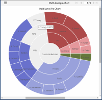
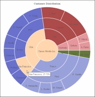
3 Choose OK, and preview the application in Web Viewer. The chart appears as shown in Figure 19‑19.
Figure 19‑19 Previewing the pie chart
You can choose an employee, and the pie chart highlights the city and the country where the employee is located. The tooltip displays the percentage of customers for each employee, city, or country. For example, sales rep F. Tseng works with 42.86% of the customers in the NYC office. The tooltip on NYC shows that 44.54% of the customers in the USA are handled by the NYC office.
Task 5: Customize the chart appearance using JSFiddle
In this task you change the title and the colors for the multilevel pie chart. You customize and test the code using JSFiddle. JSFiddle supports making changes in HTML, CSS, and JavaScript code, and instantly seeing the output. After you are satisfied with the results, you apply the changes to the template in BIRT Designer.
1 In Custom Visualization Editor—Template, choose JSFiddle. JSFiddle opens in a new browser window displaying the template code.
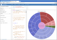
2 Choose Run to see the pie chart in Result, as shown in Figure 19‑20.
Figure 19‑20 Running JSFiddle
3 In JSFiddle, scroll down to the end of the template in the JavaScript frame, as shown in Figure 19‑21.
Figure 19‑21 Inspecting the data in JSFiddle
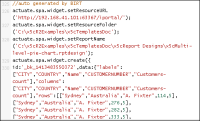
BIRT includes an autogenerated JavaScript at the end of the template. You can identify and inspect the data bound to the custom visualization.
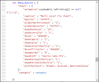
4 In JSFiddle—JavaScript, locate the code shown in Figure 19‑22, line 289.
The data_source array contains the multilevel pie chart properties. The names of the properties are self-documenting. For more information, check the FusionCharts web site.
Figure 19‑22 Changing the chart properties
5 In JSFiddle—JavaScript, change the caption property that defines the title above the chart to:
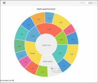
"caption" : "Customer Distribution",
6 In JSFiddle—JavaScript, change the hoverfillcolor color code from EEEEEE to FFD6AD:
"hoverfillcolor" : "FFD6AD",
7 In JSFiddle, choose Run. The new chart appears in Result, as shown in Figure 19‑23. The chart has a new title and a new fill color for the mouse selection.
After testing the changes, you can copy them to the template in BIRT Designer. When copying the template back to the designer, be careful not to copy the autogenerated code at the end of the template. This code holds the visualization item data. JSFiddle uses this data to generate the visualization.