Table and cross tab gadgets display tabular data on a dashboard. These gadgets organize values into a row-and-column matrix that appears in a table format, similar to a spreadsheet. Tables and cross tabs are useful to present detailed evidence to justify a conclusion and to display reports containing specific values such as the exchange value of multiple currencies. Users can interact with tables to format and export data using the table context menu.
You can aggregate data to create a concise summary overview of your data. For example, a detailed table displays a row for each order number, order date, and the total profit of the order. This creates a large table if you have many orders, and is difficult to identify trends. When you aggregate this data with a monthly time interval and an aggregate function such as sum, the table groups values by month to show the monthly sum of order profit. If you change the aggregate function to average, then the table displays the average order profit for each month. You can display multiple aggregations together, such as creating a table of orders, grouped by month, that displays the total sales and average sales for each month.
Cross tabs display a data source that is already aggregated, such as a data cube. You can display grand totals and subtotals in a cross tab and users can open the cross tab in the Interactive Crosstabs tool to analyze the aggregated data and add an optional chart. If your data source is a data model, you can also use a cross tab to build aggregations. Calculations are typically faster using data cubes than in a data set because the data is aggregated when the data object is created. Users can drill down into the data displayed in cross tabs. For example, in a cross tab of order status, the user can drill down to see the order numbers for a selected status, such as canceled orders.
If you designed your data objects to include links, you can select the values in the table to open the link. For example, a data object of orders includes a link on each order number to the invoice for the order.
Choosing a table type
The following tabular data formats are available:
Cross tab
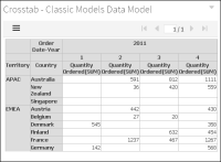
A cross tab displays data cubes and data models in a row‑and‑column matrix that has a spreadsheet-like appearance. The cross tab is ideal for summarizing data in a compact and concise format, and displays summary, or aggregate values such as sums, counts, or averages. The cross tab groups these values by one set of data listed down the left side of the matrix and another set of data listed across the top of the matrix. If your data source is a data model, you can select aggregation functions while building the cross tab. If your data source is a data cube, you use the aggregation functions that are included in the data cube when it was created. Figure 17‑22 shows a cross tab gadget.
Figure 17‑22 Displaying data in a cross tab gadget
Users can open and edit cross tabs in Interactive Crosstabs for additional analysis and to add a chart view to the cross tab. Users can format displayed values, export content, and export data using the context menu. Exporting cross tabs to Microsoft Excel pivot tables is also supported.
Table
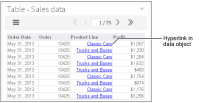
A table displays data sets and data models in a row‑and‑column format. You can display data row by row, as in the data set or you can summarize the table data. Summarizing table data presents aggregate data information in a report, providing users with an overview of the data. For example, a table can display order dates, order numbers, and the total value of every order or group of values by month to show the monthly sum of orders. Figure 17‑23 shows a table gadget.
Figure 17‑23 Displaying data in a table gadget
If you want to offer table users options for interacting with tabular data, display the data details in the table without summarizing the data. For example, conditional formatting, grouping, sorting, aggregation, and computed column creation are available to users when the tabular data is not already aggregated into summary data. If you want to offer the users concise summaries of the data but with fewer interaction options, display the data in a summary table.
Using a table
How to create a table gadget
This procedure requires a dashboard you can edit. Create a new dashboard if one does not already exist. To create a table gadget, complete the following steps:
1 In the dashboard editor, choose Insert➛Table➛Table.
2 To select the data to display in the table gadget, complete the following steps:
1 In Table Builder—Data—Data—Use Data, select a data source. If no data source appears, choose New Data to select a BIRT data object from available data objects in the BIRT project.
2 In Available Data, select fields to display in tabular format and choose the Add arrow to add to Current Column Selections.
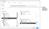
3 If your data source includes links in the data, select Enable Interactivity to display the links in the table.
3 Group and aggregate the data as a summary table, if desired, by completing the following steps:
1 Select Summarize.
2 If you have a date field in Current Column Selections, choose to group the values by a time period such as years or weeks.
3 Select any fields that you want to aggregate and choose Add to Current Measure Selections.
4 In Current Measure Selections, select an aggregation method for each data field.
4 The following optional tasks are available when you create the table or after the table is added to the dashboard:
Specify gadget appearance, such as title and gadget size, in Table Builder—General. Display a border, header, menu icon, scroll bar, and toolbar.
Limit displayed data with filter conditions, in Table Builder—Filter.
Format the table, in Table Builder—Format. For example, set the background color, border, font, and the table alignment for the header and the table body. Set a page break interval to break the table rows into pages of data.
5 Choose OK to create the new gadget.
Enable interactive filtering by linking the table to a data selection gadget. After the table is placed on the dashboard, it links to data selection gadgets that use the same data source. You can remove these links or add new ones.
Selecting data for tabular display
A table gadget displays tabular data on a dashboard. Adding a table gadget to a dashboard or editing it displays Table Builder—Data.
After choosing an available BIRT data object, choose a data set or data model. Next, select data fields to display in the table columns. To select multiple values, press Ctrl as you select each value. A typical table displays a row for every row in the data source. Figure 17‑24 shows the data source of a table gadget.
Figure 17‑24 Selecting data to display in a table gadget
Table gadgets can display hyperlinks from data objects. If hyperlinks exist in the data object file, they can appear in the table by selecting Table Builder➛Data➛Enable Interactivity. Hyperlinks enable users to open a URI or drill through to another BIRT document file when choosing a value such as a customer name in a table. This is similar to a hyperlink on a web page.
Aggregating tabular data
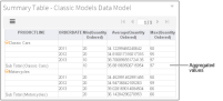
To aggregate data in a table gadget, choose Summarize in Table Builder—Data. Figure 17‑25 shows a table gadget that summarizes values from a data model.
Figure 17‑25 Aggregating data in a table gadget
Use Summarize to aggregate numeric values in the data set or data model, such as displaying the total sales for each month instead of each order. Table 17‑2 shows the aggregation functions you can select for values displayed in a table.
Table 17‑2 Aggregate functions for tables
Function
Description
Average
Returns the average of the values.
Count
Returns the number of values, including duplicate values.
Distinct Count
Returns the number of values, excluding duplicate values.
First
Returns the first value among the values.
Last
Returns the last value among the values.
Max
Returns the largest value among the values.
Median
Returns the median, or middle value among the values.
Min
Returns the smallest value among the values.
Mode
Returns the mode, or the value that occurs most frequently among the values.
Standard Deviation
Returns the standard deviation of a set of values. Standard deviation is a statistic that shows how widely values disperse from the mean value. If a set of values contains 50, 75, 80, 90, and 95, standard deviation returns 17.536.
Sum
Returns the sum of the values.
Variance
Returns the variance of a set of values. Variance is a statistical measure expressing the size of the differences between the values. The variance increases as the differences between the numbers increase. If a set of values contains 50, 75, 80, 90, and 95, variance returns 307.5. If a set of values contains 5, 2, 5, 7, and 10, variance returns 8.7.
Formatting tabular gadgets
You can customize the background, border, and font attributes used in the table rows, such as alignment, color, font, and size. You can also define how many rows to display before creating a page break using Page Break Interval.
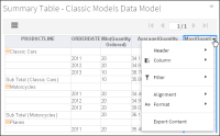
Table gadgets also support formatting, conditional formatting, grouping, sorting, aggregation, and computed column creation using the interactive context menu. These features enable users to explore and personalize the data for display or export. Figure 17‑26 shows a table gadget that summarizes values from a data model.
Figure 17‑26 Displaying the interactive context menu in a table gadget
Using a cross tab
How to create a cross tab gadget
This procedure requires a dashboard you can edit. Create a new dashboard if one does not already exist. To create a cross tab gadget, complete the following steps:
1 In the dashboard editor, choose Insert➛Table➛Crosstab.
2 To select the data to display in the cross tab gadget, complete the following steps:
1 In Crosstab Builder—Data—Data Models and Cubes—Use Data, select a data source. If no data source appears, choose New Data to select a BIRT data object from available data objects in the BIRT project.
2 If your data source includes links in the data, select Enable Interactivity to display the links in the table.
3 In Available Data, select fields to display as rows, and choose the Add arrow to add to Row.
4 In Available Data, select fields to display as columns, and choose the Add arrow to add to Column.
5 If you display a date in a row or column, select the date groups such as years and quarters.
6 In Available Data, select fields to display as aggregated summary fields, and choose the Add arrow to add to Summary Fields.
7 If your data source is a data model, select an aggregation method for each data field in Summary Fields.
3 The following optional tasks are available when you create the cross tab or after the cross tab is added to the dashboard:
Specify gadget appearance, such as title and gadget size, in Crosstab Builder—General. Display a border, header, menu icon, scroll bar, and toolbar.
Limit displayed data with filter conditions in Crosstab Builder—Filter.
Format the cross tab in Crosstab Builder—Format. For example, enable grand totals and subtotals for rows and columns. Set a page break interval to break the cross tab row and column content into multiple pages.
4 Choose OK to create the new cross tab gadget.
Enable interactive filtering by linking the cross tab to a data selection gadget. After the cross tab is placed on the dashboard, it links to data selection gadgets that use the same data source. You can remove these links or add new ones.
Selecting data for cross tab gadgets
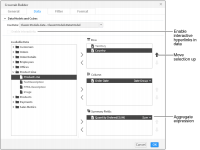
Adding a cross tab gadget to a dashboard or editing it displays Crosstab Builder. Figure 17‑27 shows an example of Crosstab Builder.
Figure 17‑27 Selecting data to display in a cross tab gadget
After choosing an available BIRT data object, choose a data cube or data model. Next, select data fields to display in the cross tab columns, rows, and summary fields. To select multiple values, press Ctrl as you select each value. For example, if the columns display the fields order date, order number, order value, and order status, these are the columns that display in the table.
Each data field in a row displays horizontally in a cross tab and each field in a column displays vertically on a cross tab. Measure fields display aggregated totals in each intersection of a column and row. You can enable grand totals and subtotals for columns and rows in Crosstab Builder—Format.
Cross tab gadgets can display hyperlinks from data objects. If hyperlinks exist in the data object file, they can appear in the cross tab by selecting Crosstab Builder➛Data➛Enable Interactivity. Hyperlinks enable users to open a URI or drill through to another BIRT document file when choosing a value such as a customer name displayed in a table. This is similar to a hyperlink on a web page.
Aggregating cross tab data
When you display a data cube in a cross tab, you select from existing aggregations that are included in the data cube. These aggregated fields are called measures, and were added to the data cube when it was created in BIRT Designer Professional.
When you display a data model in a cross tab, you can aggregate any field by adding it to Summary Fields in Crosstab Builder—Data. In the final step you select an aggregation function. Table 17‑3 shows the aggregation functions you can select for values displayed in a cross tab.
Table 17‑3 Aggregate functions for cross tabs
Function
Measure
Dimension
Description
Average
Returns the average of the values.
Count
✓
✓
Returns the number of values, including duplicate values.
Count Distinct
✓
✓
Returns the number of values, excluding duplicate values.
First
✓
✓
Returns the first value among the values.
Last
✓
✓
Returns the last value among the values.
Max
✓
✓
Returns the largest value among the values.
Median
✓
Returns the median, or middle value among the values.
Min
✓
✓
Returns the smallest value among the values.
Mode
✓
Returns the mode, or the value that occurs most frequently among the values.
Standard Deviation
✓
Returns the standard deviation of a set of values. Standard deviation is a statistic that shows how widely values disperse from the mean value. If a set of values contains 50, 75, 80, 90, and 95, standard deviation returns 17.536.
Sum
✓
Returns the sum of the values.
Variance
✓
Returns the variance of a set of values. Variance is a statistical measure expressing the size of the differences between the values. The variance increases as the differences between the numbers increase. If a set of values contains 50, 75, 80, 90, and 95, variance returns 307.5. If a set of values contains 5, 2, 5, 7, and 10, variance returns 8.7.
Formatting cross tab gadgets
Cross tab formatting supports the display of grand totals and subtotals for all rows and columns that contain two or more dimensions. You can minimize loading time of large tables by enabling page breaks at the selected column and row intervals.
Users can open a cross tab in Interactive Crosstabs to add an alternative chart display, apply conditional formatting, apply advanced filters such as relative time, pivot the table display, and apply drill up or drill down to selected fields in the cross tab. You can also open the cross tab in Interactive Crosstabs to select a visual theme for the cross tab.
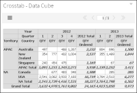
Choose Analyze from the gadget menu to open the cross tab in Interactive Crosstabs for additional analysis and formatting. You can also double-click the title of the cross tab gadget to open the cross tab in Interactive Crosstabs. Figure 17‑28 shows a table gadget that summarizes values from a data model.
Figure 17‑28 Reviewing a cross tab gadget after formatting in Interactive Crosstabs