Using the chart builder. You use the chart builder to create or modify a chart. The chart builder organizes tasks and shows your progress.
Selecting a chart type. You review the types and subtypes, so you know the different presentation possibilities for displaying your data.
Setting chart output formats. By default, the chart builder creates a chart in Scalable Vector Graphics (SVG) format. You can also create a chart in a static image file format, such as BMP or PNG.
Providing data for a chart. You create a data source and data set, then, in the chart builder, you specify that data set for the chart.
Plotting chart data. The various types of charts use data differently. You can drag and drop columns from the Chart Preview to areas of the Select Data page to define how to plot the data.
Formatting a chart. In the tutorial, you format some parts of a pie chart, such as leader lines and data labels, using settings such as text style, position, and visibility. Other chart types offer different formatting options. You can manipulate the scale or placement of data on an axis or in a pie or meter to show information effectively.
The tutorial provides step-by-step instructions to build a report that displays order totals organized by product line. The report presents information graphically in a pie chart. In this case, the chart is the entire report.
To create a chart, complete the following tasks:
Set up the report design file and data. Create a new report, data source, and data set.
Add the chart element to the report design. Insert a chart element into a report and select a chart type.
Provide data for the chart. Link the chart to a data set and build the expressions that the chart uses.
Change the chart title.
Refine the chart appearance. Remove the chart legend and modify the labels that identify each sector.
View the chart.
Task 1: Set up and query the data source
Before you start to design a chart, you must create a report design file for the chart, then set up the data source and data set that the chart uses. These tasks are discussed in detail in earlier sections of this guide and in a tutorial in which you build a sample report. This tutorial builds on that knowledge. This task shows how to select the data to build a sample pie chart.
1 To create a new report, choose File➛New➛Report.
2 Name the new report design Chart.rptdesign. Choose Finish.
3 Build a data source using the sample database, Classic Models, Inc.
4 Build a data set for the chart. Use the following data set name:
ChartData
Use the following SQL SELECT statement:
select CLASSICMODELS.PRODUCTS.PRODUCTLINE,
sum(CLASSICMODELS.ORDERDETAILS.QUANTITYORDERED)
from CLASSICMODELS.ORDERDETAILS, CLASSICMODELS.PRODUCTS
where CLASSICMODELS.PRODUCTS.PRODUCTCODE =
CLASSICMODELS.ORDERDETAILS.PRODUCTCODE
groupby CLASSICMODELS.PRODUCTS.PRODUCTLINE
orderby CLASSICMODELS.PRODUCTS.PRODUCTLINE
This SELECT statement obtains values from the ProductLine column in the Products table, groups the results by product line, and calculates the sum of the order quantities for each group.
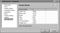
5 Choose Finish, then Preview Results to validate the query. By creating the SELECT statement correctly, you see the data shown in Figure 20‑12.
Figure 20‑12 Previewing the data set
The first column lists product line names. The second column shows the total orders for each product line. BIRT uses sequential numbers to name generated columns, such as the sum column named 2 in Figure 20‑12.
6 To rename the sum column to be more descriptive, choose Output Columns. Select column 2, then choose Edit. In Edit Output Columns, use the following settings:
1 In Alias, type:
TotalOrders
2 In Display Name, type:
TOTALORDERS
3 Choose OK.
7 To close Edit Data Set, choose OK.
Task 2: Add the chart to the report
In this task, use the palette to add a chart element, and select a chart type.
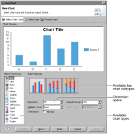
1 Choose Palette, then drag the chart element to the blank report design. The chart builder appears, as shown in Figure 20‑13.
Figure 20‑13 Selecting the chart type
The lower part of the Select Chart Type page displays the different types of charts that you can create. Some chart types include several subtypes, giving you a wide range of available types. Choosing a chart type on Select Chart Type displays the available subtypes for that type of chart. By default, these subtypes create two-dimensional charts. The selected Dimension option affects the available subtypes.
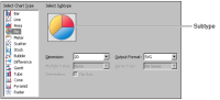
2 In the Select Chart Type list, select Pie. The chart builder shows a symbol of a pie chart in the Subtype area, as shown in Figure 20‑14. Pie charts have only one subtype, so you see only one option in the Subtype area.
Figure 20‑14 Viewing the two-dimensional subtype for a pie chart
Task 3: Provide data for a chart
In task 1, you created the data source connection and data set that you need. After selecting the data set to use, you must set up the expressions that the chart uses to represent the data graphically. Each type of chart uses data differently. For a pie chart, you must select data expressions that specify:
The data values represented by sectors in the pie. In this tutorial, you use an expression that creates one sector for each product line value.
The size of each sector. In this tutorial, the number of orders determines the size of each product line sector.
You can use different techniques to provide a data expression in a chart. The easiest way to specify the data to use is to drag a column from Data Preview to a field. You can also type the expression or use the expression builder to create an expression.
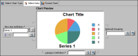
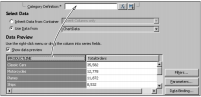
1 To navigate to the page you use to provide data, choose Select Data. The upper half of Select Data, shown in Figure 20‑15, provides a chart preview.
Figure 20‑15 Previewing the chart in the upper section of Select Data
Chart Preview displays a rough sketch of the chart for design purposes. The final published version looks more elaborate and complete, particularly if you choose to use live data for previews. In Chart Preview, the chart builder uses either live data from your data set or randomly generated sample data, depending on how you set the Enable Live Preview preference.
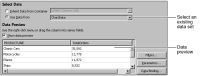
2 In the lower half of the Select Data page, select Use Data from.
This report design includes only one data set. Select ChartData from the drop‑down list. Select the Show data preview option if it is not selected. In the lower half of the chart builder, as shown in Figure 20‑16, Data Preview displays some of the data from the data set.
Figure 20‑16 Selecting a data set in the lower section of Select Data
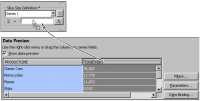
3 In Data Preview, select the PRODUCTLINE column heading, and drag it to the empty Category Definition field, as shown in Figure 20‑17.
Figure 20‑17 Supplying a category definition
A slice appears in the pie chart for each item in the category. The following expression appears in Category Definition:
row["PRODUCTLINE"]
4 To set the size of each sector, select the TotalOrders column header, and drag it to the empty field in Slice Size Definition, as shown in Figure 20‑18.
Figure 20‑18 Supplying a slice size definition
The following expression appears in Slice Size Definition:
row["TotalOrders"]
In Data Preview, the TotalOrders column is colored to show that the chart uses the column. The image in Chart Preview changes to reflect the data you specified. The product lines are now the chart categories. The size of the sectors represents the total orders for each product line category.
Task 4: Enlarge the chart and preview the report
You usually need to enlarge a chart after you finish designing it in the chart builder. The size of the default pie chart cannot accommodate all the Classic Models data, so you resize the chart in the layout editor. You need to view the report in the report viewer to ensure that the size of the chart is appropriate.
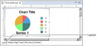
1 To close the chart builder, choose Finish. The chart element appears in the layout editor, as shown in Figure 20‑19.
Figure 20‑19 Chart element displayed in the layout editor
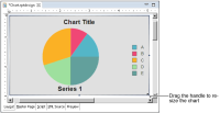
2 Choose Run➛View Report➛In Web Viewer to view the report. The chart appears small, relative to the report page. Also in this case, the chart element is too small to accommodate all the legend data. The view truncates the some of the labels and you cannot see Vintage Cars at all, as shown in Figure 20‑20.
Figure 20‑20 Viewing cramped chart before enlargement
3 To make the chart bigger so that all the data is visible and not so cramped, choose Layout, and enlarge the chart element to approximately 5 inches wide and 3 inches tall. To enlarge the chart, select it, then drag the handles that appear in the borders of the chart element, as shown in Figure 20‑21.
Figure 20‑21 Enlarging a chart element
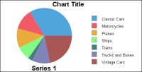
4 View the chart again. The chart appears as shown in Figure 20‑22.
Figure 20‑22 Previewing chart after enlargement
Compare the view in Figure 20‑22 with the view in Figure 20‑20. Vintage Cars is now visible in the legend.
The chart now uses the correct data, but the layout is not very attractive. Format the chart to make it visually appealing and to emphasize the points that you want. The remaining procedures in this tutorial help you to modify the chart. Some of the changes that you make include creating a new title, adjusting the data labels, and removing the legend.
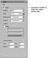
Task 5: Change the chart and value series titles
Currently, the chart displays a default title. You provide new text for the title. The chart also displays a default title for the value series. Because there is only one value series in the chart, the number of orders, no title is necessary. You hide the series title.
1 Choose Layout to return to the layout editor, then double-click the chart element in the layout editor to open the chart builder.
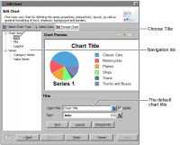
2 Choose Format Chart. In the navigation list, choose Title. The title properties appear in the lower pane of the chart builder, as shown in Figure 20‑23.
Figure 20‑23 Preparing to add a chart title in the chart area section
3 In Chart Title, type:
Orders by Product Line
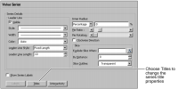
4 Choose Value Series from the navigation list. The value series properties appear, as shown in Figure 20‑24.
Figure 20‑24 Value series properties
5 In the value series properties, select Show Series Labels. Then, choose Titles. Titles appears, as shown in Figure 20‑25.
Figure 20‑25 Preparing to hide the value series title
6 Deselect Visible. The chart preview no longer shows the value series title.
Task 6: Refine the chart appearance
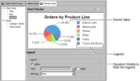
The chart includes labels that identify the data value each sector presents. A legend identifies which product line each sector represents. Though the legend includes useful information, it also takes up space and reduces the size of the pie, so you may have to make a trade-off. One possibility is to remove the legend and use sector labels to display the product line information. Using the sector labels instead of a legend is a better choice when report users cannot easily distinguish colors. Each data label displays category information and value information. In this case, the category information is the sector name and the value information is the total number of orders for the sector.
In the following example, the label identifies the motorcycles sector:
Motorcycles: 12,778
1 To modify the legend, choose Legend from the navigation list at the left.
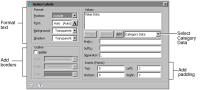
3 Now you can add the legend information to the sector labels. Navigate to the Value Series formatting section, then choose Show Series Labels and choose Labels. Series Labels appears, as shown in Figure 20‑27.
Figure 20‑27 Series Labels formatting options
4 To add the section name to the label, ensure that Category Data appears in the drop-down list in the Values area, then choose Add. Category Data appears below Value Data in the list, as shown in Figure 20‑28.
Figure 20‑28 Adding Category Data to a label
You need to rearrange the label data so that the Category Data, which are the product line names, appear before the values in the chart labels. For example, you want the label to read Classic Cars, 35,582 instead of 35,582, Classic Cars.
5 Select Category Data, and choose Up.
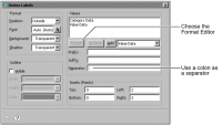
Now the labels display information in the correct order, but you still need to change the label appearance. When you use more than one kind of information in a label, you can use a separator between the different sections. The default separator is a comma.
6 To change the separator, in Separator, type a colon (:) then a space, as shown in Figure 20‑29.
Figure 20‑29 Adding a label separator
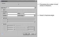
To change the number format of the value part of the label, select Value Data in Values, then choose the Format Editor. In Edit Format, you can change the format of date-and-time or numerical data.
7 Select Standard, then change the value in Fraction Digits to 0, as shown in Figure 20‑30.
Figure 20‑30 Modifying the standard number format
Choose OK to close Edit Format.
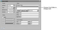
8 To change the formatting attributes of the label text, choose Font Editor, as shown in Figure 20‑31.
Figure 20‑31 Opening Font Editor from Labels
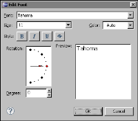
Edit Font appears.
1 In Font, select Tahoma. Then, in Size, type 11, as shown in Figure 20‑32.
Figure 20‑32 Edit Font
2 Choose OK, and close Series Labels.
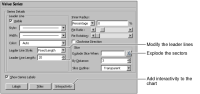
9 Now set a consistent length for the leader lines that connect the labels to the sectors. Figure 20‑33 indicates where to find the leader line settings.
Figure 20‑33 Editing leader lines and exploding sectors
1 In Leader Line Style, accept the default, Fixed Length. Change Leader Line Length to 20.
2 To separate the pie sectors so that a set amount appears between them, in Slice, set By Distance to 3.
To make the chart more useful to the report users, you can add interactive features, such as hyperlinks and highlighting. You can add interactive features to the chart area, legend, marker lines, and to other parts of the chart.
You have finished creating and formatting the chart.
10 To close the chart builder and see the chart element in the layout editor, choose Finish. Then, view the chart in the report viewer.
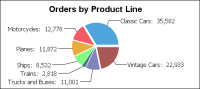
The chart appears as shown in Figure 20‑34. The completed chart shows the category names for each sector as well as the sector values. The size and organization of the chart make quick analysis possible, while still providing detailed data. For example, the user can immediately see that the largest pie sector is Classic Cars, which has 35,582 orders, followed by Vintage Cars, which has 22,933. The two car sectors are larger than all other sectors combined. Other product line groups, such as Trains, do not contribute significant numbers of orders.