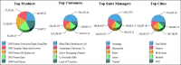
A dashboard report provides a concise view of key metrics. Those metrics might include costs, sales, customer satisfaction, or other measures critical for monitoring goals and trends. A dashboard report has the look and functionality of a dashboard in a car or plane, displaying data as a set of graphic representations. Figure 25‑2 shows an example of a dashboard report.
Figure 25‑2 Example of a dashboard report
An effective dashboard report distills extensive detail data onto a single page, and highlights trends or potential problems. A typical dashboard report presents a series of charts to display data from different perspectives, for example, sales data by product, by customer, by sales manager, and by region, as shown in Figure 25‑2.
A chart relies on data derived from typically hundreds, even hundreds of thousands, of data rows. If the data is stored in a database, you can write a query that groups, aggregates, and filters the data to return a small subset of the rows that can be used as summary data for a chart. If a dashboard report displays multiple charts, creating multiple data sets, each running a different query, can be resource-intensive.
To build a dashboard report, it is sometimes more efficient to create charts that reference, or reuse, data in another report element, typically a table or a cross tab. A data set you create for a table or a cross tab frequently returns a large number of data rows, which the table or cross tab then groups and aggregates to display the data in an organized, readable format. By using table or cross tab data, it is possible to create a single data set that multiple charts access through the table or cross tab.
A key point to remember when creating a chart that uses data from another report element is that the sorting, groups, aggregations, and filters defined in the report element also apply to the chart. You cannot sort, group, aggregate, or filter data differently in the chart. Rather than being a limitation, this behavior helps synchronize the data in various report elements.
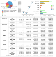
For example, the report in Figure 25‑3 shows a series of charts that use data from a cross tab. The cross tab defines a filter that enables the report user to specify at run time the quarters for which to get sales data. Each time the report runs with a different value, the cross tab and all the charts display sales data for the selected quarters. This report illustrates the primary advantage of using another report element’s data—dynamic and consistent data updates.
Figure 25‑3 Report showing three charts displaying the same data as a cross tab
Using data from a table
A table is the most common element for displaying data. A table can display pages of detail data or just summary data. You can group data to show hierarchical views of the data, display aggregate information at any group level, and filter data at the table and group levels. Because you can manipulate data in a table in ways not possible at the data set level, the table is most often used as the source of data for charts, when presenting the same data in a table and a chart.
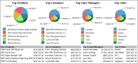
The report in Figure 25‑4 shows four charts and four tables that display summary sales data in various categories. Each chart uses data from the table below it, for example, the Top Products chart displays the top products listed in the Top 5 Products table. When data in any of the tables is updated, the data in the corresponding chart is updated, too. Figure 25‑5 shows the same report updated to display the top four performers in each category.
Figure 25‑4 Report showing charts displaying the same top‑five data as the corresponding summary tables
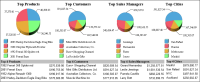
Figure 25‑5 Report showing charts displaying the same top‑four data as the corresponding summary tables
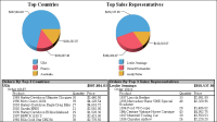
The previous report showed how you can base a chart on a table that displays summary data. You can also base a chart on a table that displays detail data. The report in Figure 25‑6 shows two charts and two tables. The table on the left displays detailed sales data grouped and aggregated by order number and country, and filtered to display only sales in the top three countries. The Top Countries chart uses data from this table to display the sales totals for the top three countries. The table on the right displays similar sales data, except by sales representative instead of country. The Top Sales Representatives chart uses data from this table to display sales totals for the top three sales representatives.
Figure 25‑6 Report showing charts displaying the same data as tables with detail data
How to create a chart that uses data from a table
This procedure assumes you have already created the table that contains the data to share with the chart.
1 Specify a name for the table, using the following steps:
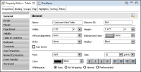
1 Select the table. In Property Editor, under Properties, choose General.
2 In Name, type a name for the table. Figure 25‑7 shows the name, CustomerOrderTable, specified for a table.
Figure 25‑7 Name property set for a table
2 Insert a chart anywhere in the report, but do not place the chart inside the table.
3 In the chart builder, select a chart type suitable for displaying the data, then choose Select Data.
4 Select the data to display in the chart, using the following steps:
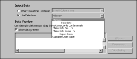
1 Under Select Data, select Use Data From, and click the down arrow to display a list of report elements from which data is available, as shown in Figure 25‑8.
Figure 25‑8 Displaying the list of elements from which a chart can use data
The list displays the report items from which you can use data below Report Items. Figure 25‑8 shows the table, CustomerOrderTable, under this category.
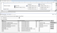
2 Select the table from which to use data. Data Preview displays the data from the selected table, as shown in Figure 25‑9. In addition to the data fields used in the table, Data Preview also displays the groups and aggregate data defined in the table. Groups and aggregate data are identified by special symbols next to the column binding names.
Figure 25‑9 Data Preview displaying data from a selected table
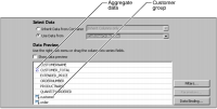
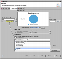
3 Select a group from Data Preview to use as the chart’s category series. You select data that is already grouped because you cannot group in a chart when using data from another report element.
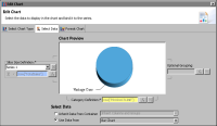
4 Select aggregate data to use as the chart’s value series. Figure 25‑10 shows an example of data selected for a pie chart. The customer group is selected for the category series. The CUSTOMER_TOTAL aggregation is selected for the value series, or, in the case of a pie chart, the slice size definition.
Figure 25‑10 Data selected for a chart
5 Choose Finish to close the chart builder.
5 Preview the report to verify that the chart displays the correct data.
Using data from a cross tab
A cross tab is the ideal element for displaying aggregate data, or measures, by multiple categories. Many types of charts are also suitable for displaying aggregate data by different categories, although not by as many categories as a cross tab. To show aggregate data by x and by y, use a chart to present the data graphically and a cross tab to present the data in a compact row‑and‑column matrix.
To present the same data in both elements, it makes sense for a chart to leverage the data in the cross tab. After you define the initial measures in the cube and insert them in a cross tab, the cross tab calculates all the subtotals and grand totals and creates all the necessary column bindings. The report in Figure 25‑3 shows three charts—order totals by product line, totals by quarter, and totals by product line and by quarter—based on a single cross tab. Figure 25‑11 shows the column bindings that BIRT creates for each measure and dimension in that cross tab.
Figure 25‑11 Column bindings defined for a cross tab
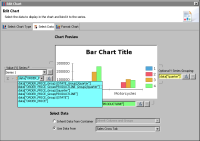
When specifying data for a chart that uses cross tab data, all you do is select a measure to use as the value series. You do not select a dimension for the category series because a measure already defines the category or categories by which the aggregate data is grouped. For example, the measure defined by the column binding ORDER_PRICE_Group/PRODUCTLINE returns the sum of order prices by product line groups. ORDER_PRICE_Group/PRODUCTLINE_Group2/quarter returns the sum of order prices by product line and by quarter.
Based on the measure you select, the chart builder assigns the appropriate dimension to the category series and, if applicable, to the optional Y series grouping as well. Figure 25‑12 shows the measure ORDER_PRICE_Group/PRODUCTLINE_Group2/quarter selected for the value series. The chart builder assigns data["PRODUCTLINE"] to the category series and data["quarter"] to the optional Y series grouping. As the Chart Preview shows, the chart displays order price totals by product line and by quarter.
Figure 25‑12 Cross tab data used in a chart
How to create a chart that uses data from a cross tab
This procedure assumes you have already created the cross tab that contains the data to use in the chart.
1 Specify a name for the cross tab, using the following steps:
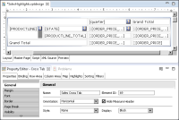
1 Select the cross tab and in Property Editor, choose the Properties tab.
2 In General properties, in Name, type a name for the cross tab. Figure 25‑13 shows the name, Sales Cross Tab, specified for a selected cross tab.
Figure 25‑13 Name property set for a selected cross tab
2 Insert a chart in the desired location in the report.
3 In the chart builder, select a chart type suitable for displaying the data, then choose Select Data.
4 Select the data to display in the chart, using the following steps:
1 Under Select Data, select Use Data From, and click the down arrow to display a list of items from which to get data.
2 Under Report Items, select the cross tab that contains the data to use.
3 Select a measure to use as the chart’s value series. Under Value (Y) Series, below Series 1, click the down arrow to display the cross tab measures, then select one of the measures. Figure 25‑14 shows an example of a list of measures.
Figure 25‑14 List of measures available for a value series
After you select a measure, the chart builder selects the appropriate data for the category series, and if applicable, the data for the optional Y series grouping. For example, if you select a measure that calculates the order totals by quarter, the chart builder selects the quarter data field for the category series, as shown in Figure 25‑15.
Figure 25‑15 Data specified for a chart
4 Choose Finish to save the chart.
5 Preview the report to verify that the chart displays the correct data.
Using data from a chart
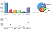
To display identical data in a series of charts, create one chart as the primary element, then create the other charts to use data from the first chart. Figure 25‑16 shows an example of a bar chart, a pie chart, and a line chart displaying identical data, sales by product line.
Figure 25‑16 Three charts displaying the same data
In the example shown in Figure 25‑16, the bar chart is the primary chart. The bar chart defines the data to use in the value and category series, and controls how the data is sorted, grouped, aggregated, and filtered. The other charts reuse this data; you cannot make any modifications to the data in the pie chart or line chart. To change the data that appears in all three charts, edit the bar chart.
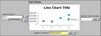
Figure 25‑17 shows the data definition for the bar chart. This chart uses data from a data set, Sales By Product Line. Value (Y) Series displays data from the TotalSales column, and Category (Y) Series displays data from the PRODUCTLINE column.
Figure 25‑17 Data specified for a primary chart
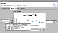
Figure 25‑18 shows the data definition for the pie chart, which uses data from the bar chart. Notice that the data specified in Slice Size Definition and Category Definition is the same data specified in the bar chart and is read‑only.
Figure 25‑18 Data reused from a primary chart
How to create a chart that uses data from another chart
This procedure assumes you have already created the primary chart.
1 Specify a name for the primary chart, using the following steps:
1 In the layout editor, select the chart. In Property Editor, choose the Properties tab.
2 In General properties, in Name, type a name for the chart.
2 Insert a second chart in the report.
3 In the chart builder, select a chart type suitable for displaying the same data as the primary chart, then choose Select Data.
4 Select the data to display in the chart, using the following steps:
1 Under Select Data, select Use Data From, and click the down arrow to display a list of items from which to get data.
2 Under Report Items, select the chart from which to use data.
The chart builder fills in the value and category series fields with the data defined in the primary chart.
5 Choose Finish to save the chart.
6 Preview the report to verify that the chart displays the correct data.