A line chart displays data values as a set of points that are connected by a line. You typically use line charts to present large amounts of data that occur over a continuous period of time. A line chart is the most basic type of chart in finance.
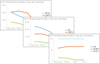
Figure 9‑3 Overlay, stacked, and percent stacked line charts
A line chart is similar to an area chart, except that the line chart does not fill in the area below the line. In an overlay line chart, multiple series appear as overlapping lines, as shown in the chart on the left in Figure 9‑3. The line chart supports stacked and percent stacked subtypes.
In a stacked line chart, multiple series are stacked vertically, as shown in the chart in the center in Figure 9‑3. The stacked line chart shows totals for each series, as well as the proportion that each series contributes to the total. In a stacked area chart, the filled‑in areas provide a clear visual cue that each part is compared to the whole.
In a percent stacked line chart, multiple series are stacked vertically and the values are shown as a percentage of the whole. As shown in the chart on the right in Figure 9‑3, the sales values appear in percentages instead of numbers. Like the percent stacked area chart, the percent stacked line chart makes sense only when displaying and comparing multiple series. Do not use this chart subtype if you are displaying only one series, for example, only sales for EMEA. Both the stacked line chart and the percent stacked line chart are not as effective as their area chart counterparts.
In addition, as the example shows, a user can easily misinterpret the data in a stacked line chart. There is no obvious indication that the top line shows the total sales amount for each product line, and the middle line shows the difference in the sales amount between EMEA and APAC.