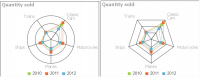
Radar charts compare the aggregate values of one or more series of data. A separate spoke from the chart center is shown for each category and each spoke is connected by an arc or line. A line is drawn connecting the data values for each spoke giving the chart a star-like appearance. Radar charts have two subtypes: standard radar charts and spider radar charts, shown in
Figure 9‑10.
A spider radar chart connects the outer spokes using lines and a standard radar chart uses arcs, as shown in the chart on the left in
Figure 9‑10. Radar charts are most effective for small data sets containing only a few hundred data rows. For larger data sets, or those containing a time series, use a line chart.