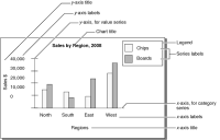
Charts include many different visual elements, as shown in Figure 9‑18. You can customize the appearance of many of these elements using Interactive Viewer. To clarify the presentation of data, or to create a more pleasing composition, you can rearrange the layout of the chart. Some of the formatting for a chart, such as the colors of the bars in a bar chart and the background color of the chart, are defined in the original report, and cannot be modified. When viewing the report you can modify the fonts and font sizes of the chart title and axis labels, and the height and width of the chart. You can hide axis labels, place labels at an angle relative to the axis, and hide the legend or determine where to display the legend in relation to the chart. Depending on the type of chart you are working with, you can also transpose the axes in some cases.
Figure 9‑18 Elements of a chart
Figure 9‑18 displays the elements of a basic bar chart that you can format using Interactive Viewer. In this example, the category series consists of a set of regions, and the value series consists of a set of sales figure values.
A chart organizes data points into value sets called series. Series can be of two types—a category series and a value series. The category series typically determines what text, numbers, or dates you see on the x‑axis. The value series typically determines the text, numbers, or dates on the y‑axis. A value axis positions data points relative to the axis tick marks. You do not plot text on a value axis. In most charts with axes, the x‑axis is the category axis, and the y‑axis is the value axis.
The plotting options available for the x‑ and y‑axes can differ in name and function, depending on the chart type. For example, when you modify a meter chart, which has no axes, you define the position of a needle on a dial instead of defining the y‑axis. When you modify a pie chart, you define the size of the slices instead of the y‑axis.
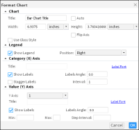
Using Interactive Viewer, you can change the titles of the axes, modify the scale of the y‑axis, and modify the orientation of the labels on the axes. Table 9‑1 describes these options.
Table 9‑1 Formatting options and their usage
Formatting options category
Properties and usage
Chart
Title
Add a title for the chart. If you select Auto, Interactive Viewer automatically generates a chart title based on the data in the chart.
Width
Width of the chart in the units specified.
Height
Height of the chart in the units specified.
Flip Axis
Select to transpose the x‑ and y‑axes.
Use Glass Style
Select this option to show smooth rounded edges for bars or columns in a chart.
Legend
Show Legend
Select to show the chart legend. Deselect to hide the chart legend.
Position
If Show Legend is selected, specify the position of the legend relative to the chart.
Category (X) Axis
Title
Provide a title that appears below the x‑axis.
Is Category Axis
Select if you want the x‑axis to display the category for each data point, for example Qtr1, Qtr2, and Qtr3. Deselect to display scaled numerical values.
Show Labels
Select to show x‑axis labels. Deselect to hide x‑axis labels.
Labels Angle
If Show Labels is selected, this option places the labels at the specified number of degrees to the x‑axis.
Stagger Labels
This option places the labels in a zigzag arrangement to improve readability.
Interval
This value on the x‑axis is set to 1 by default, which means every value appears. To display alternate values, set Interval to 2.
Value (Y) Axis
Y Axis
Specify the column whose values to display on the y‑axis.
Title
Provide a title that appears to the left of the y‑axis.
Show Labels
Select to show y‑axis labels. Deselect to hide y‑axis labels.
Labels Angle
If Show Labels is selected, this option places the labels at the specified number of degrees to the y‑axis.
Min
Type a number that represents the lowest value to display on the y‑axis. This number appears at the bottom of the y‑axis.
Max
Type a number that represents the highest value to display on the y‑axis. This number appears at the top of the y‑axis.
Step Interval
Type a number that represents the increment between each value.
How to format a chart
1 Select and right‑click the chart. Choose Format Chart from the context menu.
2 On Format Chart, shown in Figure 9‑19, you can specify formatting options. Choose OK.