Chart gadgets support interactive actions such as drilling into data details, time range selection, visual emphasis, and zoom.
You can interact with chart gadgets in the following ways:
Select date ranges using the timeline range selector and slider.
Drill into charts displaying data cubes to see summary or detail data.
Drill through charts that contain hyperlinks to other reports.
Zoom in to a chart’s x-axis, y-axis, or both to view increased detail.
Improving chart gadget rendering performance
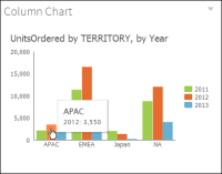
Many charts plot aggregated or summary values for one or more categories. For example, Figure 4‑48 shows a column chart that displays the number of units ordered in several sales territories for the years 2011, 2012, and 2013 by displaying bars for each territory. The chart gadget aggregates the detail rows in the data source and displays bars for each category. If there are a large number of detail rows and the data source is a data set or data model, you can improve chart rendering performance by checking Data Summarize in Chart Builder—Data. If you check Data Summarize, the data is pre-aggregated and the summary rows are used to render the chart. Checking Data Summarize does not change the appearance of the chart. Checking Data Summarize has the following benefits:
Only summary data is written to the transient document thereby reducing its size.
Only summary data is transmitted to the web browser, thereby reducing the size of the data and improving chart rendering performance.
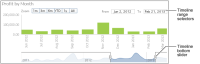
Selecting date ranges in a chart
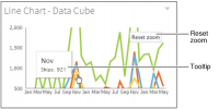
The time range selector appears under the chart title and enables a user to zoom in to 1‑, 3‑, or 6‑month intervals, year to date, 1 year, and all values on the chart. The time range slider appears at the bottom of the chart and enables users to select a time period by sliding a bar to the beginning and end of the period.
Figure 4‑47 Using a chart time range selector and bottom slider
Drilling into a chart gadget
Users can change the data displayed in a chart gadget when Drill into appears in the context menu. Users choose from available categories to view chart data in greater detail. For example, a user viewing a chart of sales data by state can drill down and see sales data by city, office, or employee.
How to drill down in a chart gadget
1 Select a shape in the chart to drill down into the category group, as shown in Figure 4‑48.
Figure 4‑48 Selecting a category to drill into
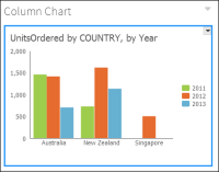
The chart updates and shows values from the selected category, as shown in Figure 4‑49.
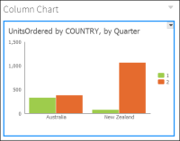
Figure 4‑49 Reviewing countries in a selected territory
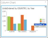
2 Select a legend value to drill down into the value group. Then, choose Drill Down, as shown in Figure 4‑50.
Figure 4‑50 Drilling down into a selected value group
The chart updates and shows values from the selected value group, as shown in Figure 4‑51.
Figure 4‑51 Reviewing countries in a selected year
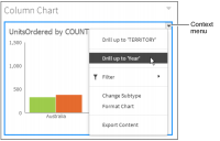
3 Choose Drill up to ‘Year’ to summarize the chart data by year, as shown in Figure 4‑52.
Figure 4‑52 Drilling up into a summary view of the data
The chart displays the new data category or series selected. Users can continue to drill down and receive more detail or drill up to the previous chart view.
Zooming in to a chart
You can zoom in to a chart to view details of displayed data. Chart gadgets and charts in BIRT documents support zooming on the x-axis, y-axis, or both at the same time. Zoom is enabled by the BIRT dashboard developer.
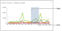
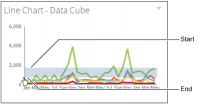
To make an x-axis zoom, select a start point on the x-axis, drag the mouse to the end point, and then release the mouse button. Figure 4‑53 shows an x-axis zoom.
Figure 4‑53 Zooming on the x-axis
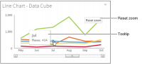
Figure 4‑54 shows the results of an x-axis zoom. Choose Reset zoom to return the chart to the default display or continue to zoom to view additional detail.
Figure 4‑54 Finished zoom on the x-axis
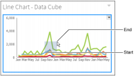
To make a y-axis zoom, select a start point on the y-axis, drag the mouse to the end point, and then release the mouse button. Figure 4‑55 shows a y-axis zoom.
Figure 4‑55 Zooming on the y-axis
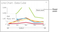
Figure 4‑56 shows the results of a y-axis zoom. Choose Reset zoom to return the chart to the default display or continue to zoom to view additional detail.
Figure 4‑56 Finished zoom on the y-axis
To make an x‑ and y-axis zoom, select a beginning point on the y-axis, drag the cursor and drop it at the end point on the x-axis. This creates a box around the points to zoom in to, as shown in Figure 4‑57.
Figure 4‑57 Zooming on the x‑ and y‑axis
Figure 4‑58 shows the results of an x‑ and y‑axis zoom.
Figure 4‑58 Finished zoom on the x‑ and y‑axis
Choose Reset zoom to return the chart to the default display or zoom again to view additional detail.
Exploding a slice of a pie or doughnut chart
A pie chart is a circular chart used to compare proportions of different categories. Data is divided into sectors or slices and the size of each slice represents a value that is proportional to the total value. To emphasize one or more slices of a pie chart or doughnut chart, you explode a slice. Press the Ctrl key while selecting a slice on the chart to explode the slice away from the center of the chart.