In Report Studio, because the data for a chart comes from the data in a table, you must create the table before you create a chart. To display only a chart in your report, hide the table after you create the chart.
A chart shows the relationship between sets of values called series. There are two types of series: value and category. A value series contains numeric values, such as prices or sales totals. These values determine, for example, the height of a bar in a bar chart or the size of a sector in a pie chart. For charts that use axes to display data, value series values appear on the y‑axis. A category series determines how to group the values, for example, by year, by country, or by product line. For charts that use axes, category series values appear on the x‑axis. For all chart types, you must select one column as the category series and at least one column as the value series. You can select two columns to display two value series. Each example in the following section shows the following items:
The type of chart
The table data on which the chart is based
The selections in HTML5 Chart—Data
Selecting data for an area, bar, column, or line chart
Area charts, bar charts, column charts, and line charts can often be used interchangeably to display the same types of data. This section shows an example of selecting data for these chart types.
Example
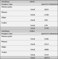
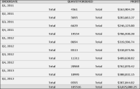
The area, bar, and line charts in Figure 6‑1, Figure 6‑2, and Figure 6‑4 show quantity ordered by product line and territory. Figure 6‑14 shows a part of the table data that the charts use. The data in the table is already aggregated. The table shows the total quantity ordered by product line. Each value is plotted in each of the charts.
Figure 6‑14 The table data used by the area, bar, line, and column charts
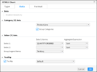
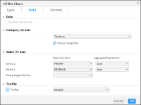
Figure 6‑15 shows the data selected in HTML5 Chart—Data for the overlay area, overlay line, side‑by‑side bar, and side‑by‑side column charts in the earlier examples. The Product Line column is the category axis and the Quantity Ordered column is the value axis. The category values are grouped by product line, and the legend values are grouped by territory.
Figure 6‑15 The data selected for the area, bar, column, and line charts
Selecting data for a pie or doughnut chart
Unlike other chart types, a pie chart can display only one value series. For example, a pie chart can show sales totals by product line, but it cannot show sales totals and profit totals by product line. This section discusses an example of selecting and organizing data for a pie or doughnut chart.
Example
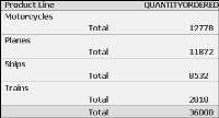
The pie and doughnut charts in Figure 6‑6 and Figure 6‑7 show quantities ordered by product line. Figure 6‑16 shows the table data that both charts use.
Figure 6‑16 The table data used by the pie and doughnut charts
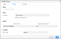
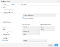
Figure 6‑17 shows how the data is selected for the charts. The Product Line column is the category series, and the Quantity Ordered column is the value series. In addition, the data is grouped by product line, and the SUM function calculates the total quantity ordered for each product line.
Figure 6‑17 The data selected for the pie and doughnut charts
Selecting data for a meter chart
Unlike most chart types, a meter chart does not display data on a y‑ or x‑axis. Instead, a meter chart displays each data value as a needle on a dial. A meter chart is used to emphasize a small number of values. This section shows an example of selecting and organizing data for meter charts.
Example: Using a meter chart
The superimposed meter chart in Figure 6‑5 shows two values, profit and revenue. Figure 6‑18 also shows the table data that the chart uses. The meter chart displays the aggregate values in the Profit and Revenue columns of the table.
Figure 6‑18 The table used by the meter chart
Figure 6‑19 shows how the data is selected for the chart. A category series is typically not essential to a meter chart, but is required in this chart, which displays profit and revenue for each territory, so the Territory column is selected. The aggregate data in the Profit column and the Revenue column are the value series.
Figure 6‑19 The data selected for the meter charts
Selecting data for a scatter or bubble chart
A scatter chart displays data as x‑y coordinates. It combines each pair of numeric values into single data points. This section shows examples of selecting and organizing data for a scatter chart and a bubble chart.
Example 1: Using a scatter chart
The scatter chart in Figure 6‑8 shows the relationship between profit and quantity ordered. Figure 6‑20 shows the table data that the scatter chart uses. The chart uses data from the Quantity Ordered and Profit columns.
Figure 6‑20 The table data used by the scatter and bubble charts
Figure 6‑21 shows how the data is selected for the chart.
Figure 6‑21 The data selected for the scatter chart
The Quantity Ordered column is the category series, and the Profit column is the value series. The data is grouped by the category axis values, and aggregated using the SUM function for the Profit column, to display total profit. The legend is grouped by order date using the year interval.
Example 2: Using a bubble chart
A bubble chart resembles a scatter chart, but shows data as bubbles instead of as points. The bubble chart shown in Figure 6‑13 uses data from the table shown in Figure 6‑20, but displays three numeric values per data point. Two numeric values, sales quarter and quantity ordered, define the position of the bubble, and a third numeric value, profit, defines the size of the bubble.
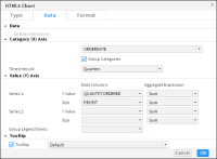
As shown in Figure 6‑22, the Order Date column, grouped by the quarter interval, is the category series and the Quantity Ordered and Profit columns are the value series. The SUM aggregate function calculates the total quantity ordered and profit values for each quarter.
Figure 6‑22 The data selected for the bubble chart
Selecting data for a stock chart
A stock chart requires the following data:
Date values as the category series
High values, low values, open values, and close values as the value series
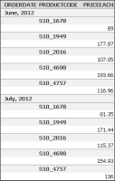
Example: Using a stock chart
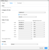
The stock chart in Figure 6‑9 shows a product’s high, low, open, and close price for seven months. Figure 6‑23 shows the table data and Figure 6‑24 shows how data is selected for the chart. The Date column is the category series. Aggregated values in the Price Each column are the value series.
Figure 6‑23 The table data used by the stock charts
Figure 6‑24 The data selected for the stock chart
Selecting data for a Gantt chart
A Gantt chart typically requires the following data:
Tasks as the category series
A date or time as the value series, showing the task beginning and end information
Example: Using a Gantt chart
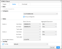
Gantt charts display schedules that use bars to show beginning and ending dates for multiple tasks. In the example shown in Figure 6‑12, one axis contains the time series, and the other contains the task being measured. The Gantt chart measures the ordering activity period for each customer. Figure 6‑25 shows the table that supplies data for the Gantt chart shown in Figure 6‑12.
The Customer name field is the category axis, the start and end times use the Order date field set as the value axis. The start and end dates are determined using the aggregate functions MIN and MAX. The legend is grouped by country.
Selecting data for a radar chart
A radar chart displays aggregate values for multiple series of data. This section shows an example of selecting and organizing data for a radar chart.
Example: Using a radar chart
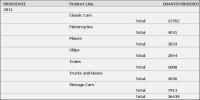
The example in Figure 6‑10 shows a standard and spider radar chart displaying quantity sold for each product line by year. Figure 6‑27 shows the table that provides data for the radar charts in Figure 6‑10.
Figure 6‑27 The table providing data for the radar chart
The Product line field is the category axis, and the Quantity ordered field is the value series. The legend displays values from the Order date field, grouped in yearly intervals. The Quantity ordered field uses the SUM aggregate function, to show the total quantity ordered by product line and year.
Selecting data for a difference chart
A difference chart typically requires the following information:
A non-numeric data field for the category series
Two sets of data values, for which deviation is measured, as the value series
Example: Using a difference chart
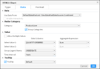
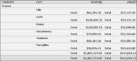
The difference chart shown in Figure 6‑11 calculates the deviation in revenue values by city. Figure 6‑29 shows part of the table providing the data for the chart shown in Figure 6‑11. Figure 6‑30 shows the data selected for the difference chart. The City field is set as the category axis, and the Revenue and Profit field are set as the value axis fields. The value axis fields can include multiple series. Both value axis fields use the SUM aggregate function to display total revenue and total profit values.
Figure 6‑29 A table providing the data for the difference chart
Figure 6‑30 Data selection for the difference chart
Displaying hyperlinks in a chart
Sometimes data fields in data objects contain hyperlinks. Hyperlinks enable users to open a URI or drill through to another BIRT document file when choosing a value such as a customer name in a table.
If hyperlinks exist, users can choose whether to display them in the chart or report table. To display existing hyperlinks in a chart, in HTML5 Chart—Data, select Enable Interactivity. To disable existing hyperlinks in a chart, in HTML5 Chart—Data, deselect Enable Interactivity.
Grouping category axis values
When the category axis contains too many values for which to display data individually, you group the values on the category axis. When you group the category axis value, the value series data is aggregated.
Displaying additional series information
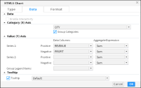
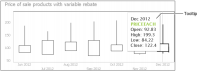
In the Chart—Data the Tooltip option appears selected by default, as shown in Figure 6‑24. A tooltip displays the value series value when a user hovers the mouse pointer over a bar in a bar chart, a sector in a pie chart, or a data‑point marker in a line chart. Figure 6‑31 shows a tooltip displaying the open, close, high, and low values for a month when the user hovers the mouse pointer over a candlestick in a candlestick stock chart.
You can disable the tooltip by deselecting the Tooltip option. You can also display a different tooltip value. To display a different tooltip value, select a different column from the drop-down list.
Figure 6‑31 A tooltip displaying a value series value