When you create a chart and use the default formatting options, the chart type and the data you select determines the basic look of the chart. The template or the software determines styles, such as fonts and colors. You can often improve the appearance of a chart by editing the placeholder text for the chart title, y‑axis title, or x‑axis title, and by changing the size or position of the x‑axis labels.
Selecting a theme
Chart themes customize the appearance of a chart and can change colors, fonts, and display properties for charts. Report Studio provides several predefined themes but custom themes can also be created using BIRT Designer Professional.
The following section shows examples of the available themes used in area charts in Report Studio:
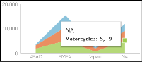
The chart in Figure 6‑32 displays the modern theme.
Figure 6‑32 An area chart using the modern theme
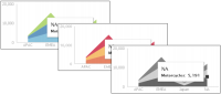
The example in Figure 6‑33 shows area charts using the clean blue, warm red, and grayscale themes.
Figure 6‑33 Area charts using the clean blue, warm red, and grayscale themes
Using the timeline options
Timeline charts, such as stock charts, can be enhanced to provide zooming options such as the time range selector, scrollbar, and a timeline slider. Using these options is specifically useful when navigating data in a lengthy report that includes a time dimension showing data for hourly or daily stock value over the period of several years.
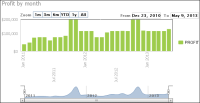
In Report Studio, you can select a time range selector and a timeline slider bar for users to set time intervals in area, bar, column, difference, line, scatter, and stock charts. Figure 6‑34 shows a chart displaying the time range selector and timeline slider.
Figure 6‑34 Enabling the timeline option in a column chart
The time range selector appears below the chart title and enables a user to view details in small time intervals, year to date, one year, in addition to all the values displayed in the chart. The timeline slider appears at the bottom of the chart and enables users to select a time period by sliding a bar to the beginning or end of the time period. When the category is a time field, you can select the time range selector and timeline slider.
Selecting other formatting options
The following table describes the formatting options available in Report Studio, and the purpose of each option.
Table 6‑1 Formatting options and their usage
Formatting option
Usage
Title
Add a title for the chart. This step is more essential if you plan to display the chart and hide the table.
Theme
Optionally select a predefined theme to change the appearance of the chart.
Chart size
Specify a width and height for the chart.
Subtype
Select a subtype from the available options based on the data you want to present in the chart.
Use Glass Style
Select this option to show smooth, rounded edges for bars or columns in a chart.
Allow zoom into
Select this option to enable users to closely analyze details for a specific area on the axis.
Auto scroll bar
Select to enable users to scroll vertically or horizontally, for charts that are too wide.
Legend Title
You can specify whether to display a legend title and select its position.
X‑axis title
Provide a title that appears below the x‑axis.
Y‑axis title
Provide a title that appears to the left of the y‑axis.
Axis label properties
Is Category Axis: Select if you want the x‑axis to display the category for each data point, for example Qtr1, Qtr2, and Qtr3. Deselect to display scaled numerical values.
Interval: This value on the x‑axis is set to 1 by default, which means every value appears. To display alternate values, set Interval to 2.
Angle: This option places the labels at the specified number of degrees to the axis.
Stagger: This option places the labels in a zigzag arrangement.
Step
Type a number that represents the increment between each value. For the y‑axis, you can specify a minimum and maximum interval:
Minimum: Type a number that represents the lowest value to display on the y‑axis. This number appears at the bottom of the y‑axis.
Maximum: Type a number that represents the highest value to display on the y‑axis. This number appears at the top of the y‑axis.
The available formatting options differ based on the chart type you use.