You can insert a chart at the table level in a summary table. Report Studio assigns the outermost grouped column as the category, or
x‑axis, by default. You can select the value series on the
y‑axis from the available measure columns.
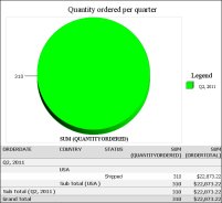
Figure 4‑17 shows a pie chart displaying the total product quantities ordered each quarter. The outermost grouped column is Order Date, which Report Studio sets as the category axis. You can choose either of the two measure columns as the
y‑axis, or both, to display multiple value series.