About data groups, drill down and drill up
Dashboard developers make data more readable and dynamic by displaying it in groups. Data sets grouped by category enable aggregation of values in chart gadgets. For example, a chart groups order data by country and displays the sales value of the orders with the aggregate expression sum. The resulting chart shows each country name once with a sum of all sales for each country. Ungrouped categories increase chart complexity and rendering time because each data set row creates a value on the chart.
Chart gadgets can group legend values to display subgroups in data sets. For example, a dashboard developer creates a chart displaying the total sales for each territory. The developer then groups legend values in the chart by product line. The resulting chart displays the sum of sales in each territory, grouped by product line, as shown in
Figure 4‑21.
Figure 4‑21 Displaying a data set, grouped by category and legend items
Chart gadgets support drill down and drill up when displaying data cubes. This enables dashboard users to view detail or summary information from a data cube. Users choose a level of the category dimension to view in the chart. These categories are defined in the dimension group of the data cube. Cross tab gadgets and charts displayed in cross tab gadgets support drill down and drill up when viewed in BIRT Data Analyzer.
For example, a user viewing a chart of sales data by country can drill down and view related sales data by city, office, or employee.
Figure 4‑22 shows a user drilling into a territory to view details about the countries inside the territory.
Figure 4‑22 Drilling into a data cube using a chart gadget
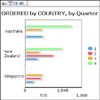
The user then drills into a year to see details about the quarters of the selected year, as shown in
Figure 4‑23.
Figure 4‑23 Drilling into a year to see details
Dashboard developers can enable drill down in a second dimension by grouping the chart legend values with the second dimension. For example, the previous chart displaying locations in the data cube can also group legend values by a time dimension such as year. The resulting chart enables users to drill down to different time periods in the time dimension, such as quarters, months, and weeks. This enables the user to change the time period and location to view data without editing the configuration of the chart gadget.
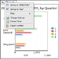
Users can continue to drill into the data cube, apply filters or export the chart or data.
Figure 4‑24 shows the context menu of the chart gadget and the choices a user has to continue analyzing data displayed in the chart.
Figure 4‑24 Selecting additional drill‑down and drill‑up options


