How to create a chart gadget
This procedure requires a dashboard you can edit. Create a new dashboard if one does not already exist. To create a chart gadget, complete the following steps:
1 Display available gadgets by selecting Add Content and choosing New Gadget.
2 Choose the Data Visualization folder. If the folder is not visible, choose Home first.
3 Drag a chart gadget type, such as a column chart and drop it on the dashboard.
4 Specify the desired gadget appearance in Chart Builder—General:

Display the header, border, and scroll bar.

Gadget title.

Refresh rate.
5 To select the data to display in the chart, complete the following steps:
1 In Chart Builder—Data—Use Data From, select a data source.
2 Select fields from the data source to display in the chart.
3 Specify data aggregations and groups as desired.
6 Limit displayed data with filter conditions, if desired, in Chart Builder—Filter.
7 Format the chart, if desired, using chart options in Chart Builder—Format:

Select a BIRT chart theme.

Set the chart size within the gadget.

Select a chart subtype, such as side-by-side, stacked, or percent stacked.

Enable zoom on the
x‑axis,
y‑axis or both for user data selection.
8 Choose OK to create the new gadget.
Enable interactive filtering by linking the chart to a data selection gadget. After the chart is placed on the dashboard, it links to data selection gadgets that use the same data source. You can remove these links or add new ones.
Displaying data in charts
Adding a chart gadget to a dashboard or editing it, displays Chart Builder—Data, where the developer selects data to display in the chart. Chart gadgets can display data from any data set or cube in a single data object file. The dashboard developer assigns the data to the different parts of the chart. Each chart type presents data differently. If hyperlinks exist in the data object file, they can appear in the chart by selecting Chart Builder—Data—Use default hyperlink.
Chart gadgets that display data cubes enable users to drill down into category and series data. For example, a chart showing stock by year and country supports drill-down to look at the time category in greater detail such as quarters or months. After finding the right time view, the user can then drill down to a more detailed location view like city.
Dashboard developers can also limit the data that appears in the gadget by using Chart Builder—Filter to create filter conditions. For more information about filtering, see
Filtering a gadget data source, earlier in this section.
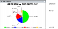
Tooltips can appear in a chart gadget and display the following information:

Category data

Values from a column in a data set

Value data

Value series name
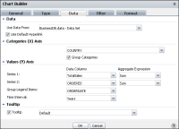
Area, bar, column, line and scatter chart gadgets can display and group data categories, like names of countries or product types, as shown in
Figure 4‑26.
Figure 4‑26 Selecting data to display as an area, bar, column, line, or scatter chart
When grouping category values or legend items that are dates, an additional option for selecting the time interval appears. For example, grouping category values by an order date enables the developer to select a time interval of years, quarters, months, weeks, and days. The chart displays data grouped to the selected time interval.
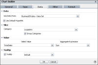
Pie and doughnut chart gadgets use slices to group and display categories of data, such as names of countries or product types, as shown in
Figure 4‑27. Values define the size of each slice relative to the other slices.
Figure 4‑27 Selecting data to display as a pie or doughnut chart
Dashboard developers can use aggregate expressions to summarize data set values. Values from a data cube are already aggregated.
Table 4‑2 shows the aggregate expressions available in chart gadgets.
Table 4‑2 Aggregate expressions for chart gadgets
Function | Description |
Average | Returns the average of the values |
Count | Returns the number of values, including duplicate values |
Distinct Count | Returns the number of values, excluding duplicate values |
First | Returns the first value among the values |
Last | Returns the last value among the values |
Max | Returns the largest value among the values |
Min | Returns the smallest value among the values |
Sum | Returns the sum of the values |
Chart gadgets support drill-down and drill-up of categories and series values from a data cube. Drill-down by series requires Group Legend Items be set to a dimension in the cube.
For example, a user viewing a chart of sales data can drill down from territory to country when location is set as a category. When the Group legend items is set to year, the user can drill down to view sales in the quarters of a specific year while still viewing the data for the selected location.
Figure 4‑28 shows an example of this type of drill-down analysis.
Figure 4‑28 Drill choices in a data cube-based chart
Changing fonts in charts
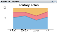
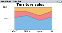
Although chart themes offer reusable customizations such as font selection, you can customize the font attributes used in each chart gadget, such as font, size, and color. Use a chart’s context menu to access font configuration.
To change a chart gadget’s fonts, complete the following steps:
1 Click in the chart title to display the chart context menu.
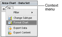
2 Choose Format Chart from the chart’s context menu, as shown in
Figure 4‑29.
Figure 4‑29 Selecting Format Chart from the context menu
3 Select Title Font or Label Font for the part of the chart you want to edit.
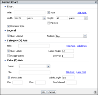
Figure 4‑30 shows the Format Chart options.
Figure 4‑30 Selecting Title Font or Label Font
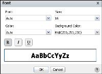
4 In Font, select your desired font attributes and choose OK.
Figure 4‑31 shows the Format Chart options.
Figure 4‑31 Selecting font attributes
5 Choose OK to close Format Chart. The chart gadget updates to display the new font attributes.
Using chart themes
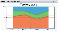
Chart themes customize the appearance of the chart and can contain custom JavaScript for enhanced interactivity. Each theme changes the chart’s colors, fonts and chart display. These themes are created in BIRT Designer Professional. Custom themes can be installed in BIRT iHub for use in BIRT dashboards.
Themes are selected using the Chart Builder—Format options as shown in
Figure 4‑32. Themes enable multiple charts to display consistent color and font use.
Figure 4‑32 Selecting a chart theme
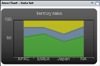
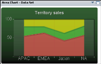
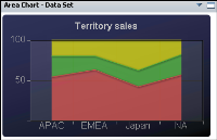
The following themes are available:
Figure 4‑33 Selecting no theme
Figure 4‑34 Selecting the default theme
Figure 4‑35 Selecting the Chart Grid theme
Figure 4‑36 Selecting the Chart Gray theme
Figure 4‑37 Selecting the Chart Green theme
Figure 4‑38 Selecting the Chart Blue theme
Formatting an area chart
An area chart displays data values as a set of points, connected by a line, with the area below the line filled. You typically use an area chart to present data that occurs over a continuous period of time. You can format an area chart gadget to modify its appearance on a dashboard using Chart Builder.
Figure 4‑39 shows the elements that you can modify.
Figure 4‑39 Displaying a percent stacked area chart
Choose Edit from the gadget menu or create a new gadget to open Chart Builder. In Chart Builder, select Format to see formatting options. The following formatting options are available for an area chart:

Change the title of the chart.
If Auto is selected for the chart’s title, the chart title changes as a user drills down to view more detailed data or drills up to view summary data.
For example, a chart title of TotalSales by Country, changes to TotalSales by City when a user drills down to display cities of a selected country. Remove the auto selection to prevent the title from changing.
Figure 4‑40 Formatting an area chart

Use Chart options to change the chart display, such as width and height.
Select a chart theme to change the appearance of the chart. For more information about themes, see
Filtering a gadget data source, earlier in this section.
If you are displaying multiple values, the chart subtype can be set to display these values as overlay, stacked or percent stacked. Selecting the glass style displays the chart bars with a glass-like fill.
Chart users can zoom in to the chart to view details of the selected data when allow zoom is enabled for categories or values.

Change the chart legend using the Legend options, as shown in
Figure 4‑41.
Figure 4‑41 Formatting an area chart legend
The legend identifies values displayed on the chart. Clicking on a legend value when the chart displays a data set highlights the corresponding value on the chart. Clicking on a legend value when the chart displays a data cube drills down to view details of the value. Display a legend on the chart by selecting Show Legend and a position for the legend to appear, relative to the chart.

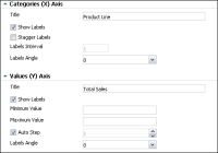
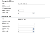
Customize the presentation of the chart’s axis values using the Categories and Values options.
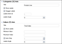
You can display titles and labels for both categories and values. The x‑axis can display labels at an angle, staggered, and at intervals. For example, an interval of 2 displays every other label on the x‑axis. To only show data between two values, you can set a minimum and maximum value for the y‑axis.
When auto step is enabled, the y‑axis appears with horizontal lines and value markers. When auto step is disabled, you can select a fixed number of vertical lines and value markers.
Figure 4‑42 Customizing axis values of an area chart
Formatting a bar chart
A bar chart displays data values as a set of horizontal bars and is useful for displaying data side-by-side for easy comparison. You can format a bar chart gadget to modify its appearance on a dashboard using Chart Builder.
Figure 4‑43 shows the elements that you can modify.
Figure 4‑43 Displaying a stacked bar chart gadget
Choose Edit from the gadget menu or create a new gadget to open Chart Builder. In Chart Builder, select Format to see formatting options. The following formatting options are available for a bar chart:

Change the title of the chart.
If Auto is selected for the chart’s title, the chart title changes as a user drills down to view more detailed data or drills up to view summary data.
For example, a chart title of TotalSales by Country, changes to TotalSales by City when a user drills down to display cities of a selected country. Remove the Auto selection to prevent the title from changing.
Figure 4‑44 Formatting a bar chart

Use Chart options to change the chart display, such as width and height.
Select a chart theme to change the appearance of the chart. For more information about themes, see
Filtering a gadget data source, earlier in this section.
If you are displaying multiple values, the chart subtype can be set to display these values side-by-side, stacked or percent stacked. Selecting the glass style displays the chart bars with a glass-like fill. Chart users can zoom in to the chart to view details of the selected data when allow zoom is enabled for categories or values.
Flash-based bar charts appear three-dimensional when 2D with depth is selected in Dimension. Flash-based charts are available in the Extras gadget category.

Use Legend options to change the chart legend, as shown in
Figure 4‑45.
The legend identifies values displayed on the chart. Clicking on a legend value when the chart displays a data set highlights the corresponding value on the chart. Clicking on a legend value when the chart displays a data cube drills down to view details of the value. Display a legend on the chart by selecting Show Legend and a position for the legend to appear, relative to the chart.
Figure 4‑45 Formatting a bar chart legend

Customize the presentation of the chart’s axis values using the Categories and Values options.
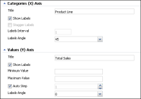
You can display titles and labels for both categories and values. The x‑axis can display labels at an angle, staggered, and at intervals. For example, an interval of 2 displays every other label on the x‑axis. To only show data between two values, you can set a minimum and maximum value for the y‑axis.
When auto step is enabled, the
y‑axis appears with horizontal lines and value markers. When auto step is disabled, you can select a fixed number of vertical lines and value markers.
Figure 4‑46 shows these options.
Figure 4‑46 Customizing axis values of a bar chart
Formatting a column chart
A column chart displays data values as a set of vertical bars and is useful for displaying data side-by-side for easy comparison. You can format a column chart gadget to modify its appearance on a dashboard using Chart Builder.
Figure 4‑47 shows the elements that you can modify.
Figure 4‑47 Displaying a percent stacked column chart
Choose Edit from the gadget menu or create a new gadget to open Chart Builder. In Chart Builder, select Format to see formatting options. The following formatting options are available for a column chart:

Change the title of the chart.
If Auto is selected for the chart’s title, the chart title changes as a user drills down to view more detailed data or drills up to view summary data. For example, a chart title of TotalSales by Country, changes to TotalSales by City when a user drills down to display cities of a selected country. Deselect Auto to prevent the title from changing.
Figure 4‑48 shows these options.
Figure 4‑48 Formatting a column chart
Use Chart options to change the chart display, such as width and height. To change the appearance of the chart, select a chart theme. For more information about themes, see
Filtering a gadget data source, earlier in this section.
If you are displaying multiple values, the chart subtype can be set to display these values side-by-side, stacked or percent stacked. Selecting the glass style displays the chart bars with a glass-like fill. Chart users can zoom in to the chart to view details of the selected data when allow zoom is enabled for categories or values.
Flash-based column charts appear three-dimensional when 2D with depth is selected in Dimension. Flash-based charts are available in the Extras gadget category.

Change the chart legend using the Legend options, as shown in
Figure 4‑49.
The legend identifies values displayed on the chart. Clicking on a legend value when the chart displays a data set highlights the corresponding value on the chart. Clicking on a legend value when the chart displays a data cube drills down to view details of the value. Display a legend on the chart by selecting Show Legend and a position for the legend to appear, relative to the chart.
Figure 4‑49 Formatting a column chart legend

Customize the presentation of the chart’s axis values using the Categories and Values options.
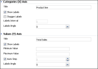
You can display titles and labels for both categories and values. The x‑axis can display labels at an angle, staggered, and at intervals. For example, an interval of 2 displays every other label on the x‑axis. To only show data between two values, you can set a minimum and maximum value for the y‑axis.
When auto step is enabled, the
y‑axis appears with horizontal lines and value markers. When auto step is disabled, you can select a fixed number of vertical lines and value markers.
Figure 4‑50 shows these options.
Figure 4‑50 Customizing axis values of a column chart
Formatting a doughnut chart
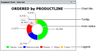
A doughnut chart is a circular chart that is divided into sectors or slices. Each sector represents a value that is proportional to the sum of the values. You can format a doughnut chart gadget to modify its appearance on a dashboard using Chart Builder.
Figure 4‑51 shows the elements that you can modify.
Figure 4‑51 Displaying a doughnut chart
Choose Edit from the gadget menu or create a new gadget to open Chart Builder. In Chart Builder, select Format to see formatting options. The following formatting options are available for a doughnut chart:

Change the title of the chart.
If Auto is selected for the chart’s title, the chart title changes as a user drills down to view more detailed data or drills up to view summary data. For example, a chart title of TotalSales by Country, changes to TotalSales by City when a user drills down from countries to cities. Remove the Auto selection to prevent the title from changing.
Figure 4‑52 Formatting a doughnut chart

Use Chart options to change the chart display, such as width and height.
Select a chart theme to change the appearance of the chart. For more information about themes, see
Filtering a gadget data source, earlier in this section.
Flash-based doughnut charts appear three-dimensional when 2D with depth is selected in Dimension. Inner radius, outer radius and rotation of the chart can also be set in the Flash doughnut chart. Flash-based charts are available in the Extras gadget category.

Change the chart legend using the Legend options, as shown in
Figure 4‑53.
The legend identifies values displayed on the chart. Clicking on a legend value when the chart displays a data set highlights the corresponding value on the chart. Clicking on a legend value when the chart displays a data cube drills down to view details of the value. Display a legend on the chart by selecting Show Legend and a position.
Figure 4‑53 Formatting a doughnut chart legend
Formatting a line chart
A line chart displays data values as a set of points that are connected by a line. You typically use line charts to present large amounts of data that occur over a continuous period of time. You can format a line chart gadget to modify its appearance on a dashboard using Chart Builder.
Figure 4‑54 shows the elements that you can modify.
Figure 4‑54 Displaying a line chart
Choose Edit from the gadget menu or create a new gadget to open Chart Builder. In Chart Builder, select Format to see formatting options. The following formatting options are available for a line chart:

Change the title of the chart.
If Auto is selected for the chart’s title, the chart title changes as a user drills down to view more detailed data or drills up to view summary data. For example, a chart title of TotalSales by Country, changes to TotalSales by City when a user drills down to display cities of a selected country. Remove the Auto selection to prevent the title from changing.
Figure 4‑55 Formatting a line chart

Use Chart options to change the chart display, such as width and height.
Select a chart theme to change the appearance of the chart. For more information about themes, see
Filtering a gadget data source, earlier in this section.
Chart users can zoom in to the chart to view details of the selected data when allow zoom is enabled for categories or values.

Change the chart legend using the Legend options, as shown in
Figure 4‑56.
The legend identifies values displayed on the chart. Clicking on a legend value when the chart displays a data set highlights the corresponding value on the chart. Clicking on a legend value when the chart displays a data cube drills down to view details of the value. Display a legend on the chart by selecting Show Legend and a position for the legend to appear, relative to the chart.
Figure 4‑56 Formatting a line chart legend

Customize the presentation of the chart’s axis values using the Categories and Values options, as shown in
Figure 4‑57.
You can display titles and labels for both categories and values. The x‑axis can display labels at an angle, staggered, and at intervals. For example, an interval of 2 displays every other label on the x‑axis. To only show data between two values, you can set a minimum and maximum value for the y‑axis.
When auto step is enabled, the y‑axis appears with horizontal lines and value markers. When auto step is disabled, you can select a fixed number of vertical lines and value markers.
Figure 4‑57 Customizing axis values of a line chart
Formatting a pie chart
A pie chart is a circular chart that is divided into sectors or slices. Each sector represents a value that is proportional to the sum of the values. You can format a pie chart gadget to modify its appearance on a dashboard using Chart Builder.
Figure 4‑58 shows the elements that you can modify.
Figure 4‑58 Displaying a pie chart
Choose Edit from the gadget menu or create a new gadget to open Chart Builder. In Chart Builder, select Chart Builder—Format to see formatting options.
The following formatting options are available for a pie chart:

Change the title of the chart.
If Auto is selected for the chart’s title, the chart title changes as a user drills down to view more detailed data or drills up to view summary data. For example, a chart title of TotalSales by Country, changes to TotalSales by City when a user drills down to display detail values of a selected country. Remove the Auto selection to prevent the title from changing.

Use Chart options to change the chart display, such as width and height.
Select a chart theme to change the appearance of the chart. For more information about themes, see
Filtering a gadget data source, earlier in this section.
Flash-based pie charts appear three-dimensional when 2D with depth is selected in Dimension. Radius and rotation of the chart can also be set in the Flash pie chart. Flash-based charts are available in the Extras gadget category.
Figure 4‑59 Formatting a pie chart

Change the chart legend using the Legend options, as shown in
Figure 4‑60.
The legend identifies values displayed on the chart. Clicking on a legend value when the chart displays a data set highlights the corresponding value on the chart. Clicking on a legend value when the chart displays a data cube drills down to view details of the value. Display a legend on the chart by selecting Show Legend and a position for the legend to appear, relative to the chart.
Figure 4‑60 Formatting a pie chart legend
Formatting a scatter chart
A scatter chart presents data as x‑y coordinates by combining two sets of numeric values into single data points. A scatter chart typically is used to display scientific and statistical data, because it shows if there is a relationship between two sets of measurements. You can format a scatter chart gadget to modify its appearance on a dashboard using Chart Builder.
Figure 4‑61 shows the elements that you can modify.
Figure 4‑61 Displaying a scatter chart
Choose Edit from the gadget menu or create a new gadget to open Chart Builder. In Chart Builder, select Format to see formatting options. The following formatting options are available for a line chart:

Change the title of the chart.
If Auto is selected for the chart’s title, the chart title changes as a user drills down to view more detailed data or drills up to view summary data. For example, a chart title of TotalSales by Country, changes to TotalSales by City when a user drills down to display cities of a selected country. Remove the Auto selection to prevent the title from changing.
Figure 4‑62 Formatting a scatter chart

Use Chart options to change the chart display, such as width and height.
Select a chart theme to change the appearance of the chart. For more information about themes, see
Filtering a gadget data source, earlier in this section.
Chart users can zoom in to the chart to view details of the selected data when Allow Zoom is enabled for categories or values.

Change the chart legend using the Legend options, as shown in
Figure 4‑63.
Figure 4‑63 Formatting a scatter chart legend
The legend identifies values displayed on the chart. Clicking on a legend value when the chart displays a data set highlights the corresponding value on the chart. Clicking on a legend value when the chart displays a data cube drills down to view details of the value. Display a legend on the chart by selecting Show Legend and a position for the legend to appear, relative to the chart.

Customize the presentation of the chart’s axis values using the Categories and Values options.
You can display titles and labels for both categories and values. The x‑axis can display labels at an angle, staggered, and at intervals. For example, an interval of 2 displays every other label on the x‑axis. To only show data between two values, you can set a minimum and maximum value for the y‑axis.
When auto step is enabled, the y‑axis appears with horizontal lines and value markers. When auto step is disabled, you can select a fixed number of vertical lines and value markers.
Figure 4‑64 Customizing axis values of a scatter chart
