How to create a Flash gadget
This procedure requires a dashboard you can edit. Create a new dashboard if one does not already exist. To create a Flash gadget, complete the following steps:
1 Display available gadgets by selecting Add Content and choosing New Gadget.
2 Choose the Data Visualization folder. If the folder is not visible, choose Home first.
3 Choose the right arrow in the New Gadget pane until you see Linear Gauge. Drag a Flash gadget, such as linear gauge, and drop it on the dashboard.
4 Specify desired gadget display options in Gadget Builder—General:

Display the header, border, and scroll bar.

Gadget title.

Refresh rate.
5 To specify the data presented in the Flash gadget, complete the following steps:
1 In Gadget Builder—Data—Use Data From, select a data source.
2 Select fields from the data source to display in the Flash gadget.
6 Limit displayed data with filter conditions, if desired, in Gadget Builder—Filter.
7 Format the Flash gadget, if desired, in Gadget Builder—Format.
8 Choose OK to create the new gadget.
Enable interactive filtering by linking the Flash gadget to a data selection gadget. After the Flash gadget is placed on the dashboard, it links to data selection gadgets that use the same data source. You can remove these links or add new ones.
Displaying data in Flash gadgets
Editing or adding an Adobe Flash gadget to a dashboard displays Gadget Builder—Data, where the developer selects data to display. A Flash gadget can display any data set or data cube from a data object file.
Dashboard developers can also limit the data that appears in the gadget by using Gadget Builder—Filter to create filter conditions. For more information about filtering, see
Filtering a gadget data source, earlier in this section.
If hyperlinks exist in the data object file, they can appear in the gadget by selecting Gadget Builder—Data—Use default hyperlink.
The developer assigns data to the different parts of the gadget. Each Flash gadget type has a different way of presenting data.
Linear and meter Flash gadgets support multiple values and data aggregation, as shown in
Figure 4‑69.
Figure 4‑69 Selecting data to display as a meter or linear gauge
Dashboard developers can use aggregate expressions to summarize data set values in the gadget.
Table 4‑3 shows the aggregate expressions available in Flash gadgets.
Table 4‑3 Aggregate expressions for Flash gadgets
Function | Description |
Average | Returns the average of the values |
Count | Returns the number of values, including duplicate values |
Distinct Count | Returns the number of values, excluding duplicate values |
First | Returns the first value among the values |
Last | Returns the last value among the values |
Max | Returns the largest value among the values |
Min | Returns the smallest value among the values |
Sum | Returns the sum of the values |
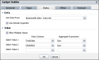
Bullet, cylinder, and thermometer Flash gadgets support a single value and data aggregation, as shown in
Figure 4‑70.
Figure 4‑70 Selecting data to display as a bullet, cylinder, or thermometer
Sparkline Flash gadgets support a single value and selecting a second value for grouping the data from a data cube, as shown in
Figure 4‑71.
Figure 4‑71 Selecting data to display as a sparkline
Grouping data enables you to see the aggregated measure value for a specific dimension. For example, grouping the values by the dimension of month displays the aggregated values for each month, and shows the opening, closing, high and low values for the entire sparkline.
Formatting a bullet gadget
You can format a bullet gadget to modify its appearance on a dashboard.
Figure 4‑72 shows the formatting elements that you can modify.
Figure 4‑72 Displaying a horizontal bullet gadget
Choose Edit from the gadget menu or create a new gadget to open Gadget Builder. In Gadget Builder, select Gadget Builder—Format to see formatting options. The following formatting options are available for a bullet gadget:

Change the appearance of the gadget using the Flash Gadget options, as shown in
Figure 4‑73.
The dashboard developer can change the orientation and dimensions of the Flash gadget. You can customize the color of the displayed value and the font attributes used in the gadget, such as font, size, and color.
Figure 4‑73 Formatting Flash gadget options

Change the appearance of data values using the Plot and Scale options.
Dashboard developers can display plot and scale values on the gadget. Set a limit on the displayed value by setting a minimum and maximum value to the Scale. For example, if the gadget is showing scale values up to 2000 but the actual value is less than 1000, you can set the maximum value of the scale to be 1200.
Figure 4‑74 shows these options.
Figure 4‑74 Formatting Flash gadget data values

Change the appearance of the gadget using the Region and Tick Marks options, as shown in
Figure 4‑75.
Figure 4‑75 Formatting the region and tick marks
You can add colored regions to appear on the gadget by adding a region and assigning a start value, end value, and a color for the region.
Enabling auto adjust tick marks displays a calculated number of ticks. Disable auto adjust tick marks to display a fixed number of ticks.
The dashboard developer can select colors for the gadget, the font used, and the regions in the bullet gadget. For more information about selecting colors, see
Using the color picker, earlier in this section.
Formatting a cylinder gadget
You can format a cylinder gadget to modify its appearance on a dashboard.
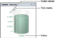
Choose Edit from the gadget menu or create a new gadget to open Gadget Builder. In Gadget Builder, select Gadget Builder—Format to see formatting options.
Figure 4‑76 shows the elements you can modify.
Figure 4‑76 Displaying a cylinder gadget
The following formatting options are available for a cylinder gadget:

Change the appearance of the gadget using the Flash Gadget options, as shown in
Figure 4‑77.
Figure 4‑77 Formatting Flash gadget options
The dashboard developer can change the dimensions of the Flash gadget. You can customize the color of the displayed value and the font attributes used in the gadget, such as font, size and color.

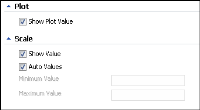
Change the appearance of data values using the Value and Scale options, as shown in
Figure 4‑78.
Figure 4‑78 Formatting Flash gadget data values
Dashboard developers can display plot and scale values on the gadget. Set a limit on the displayed value by setting a minimum and maximum value to the Scale. For example, if the gadget is showing scale values up to 2000 but the actual value is less than 1000, you can set the maximum value of the scale to be 1200.

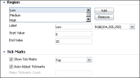
Change the appearance of the gadget using the Tick Marks options, as shown in
Figure 4‑79.
Figure 4‑79 Formatting the tick marks
Enabling auto adjust tick marks displays a calculated number of ticks. Disable auto adjust tick marks to display a fixed number of ticks.
You can select the colors and font used in the cylinder. For more information about selecting colors, see
Using the color picker, earlier in this section.
Formatting a linear gauge gadget
You can format a linear gauge gadget to modify its appearance on a dashboard.
Figure 4‑80 shows the elements you can modify.
Figure 4‑80 Displaying a linear gauge gadget
Choose Edit from the gadget menu or create a new gadget to open Gadget Builder. In Gadget Builder, select Gadget Builder—Format to see formatting options. The following formatting options are available for a linear gauge gadget:

Change the appearance of the gadget using the Flash Gadget options, as shown in
Figure 4‑81.
Figure 4‑81 Formatting Flash gadget options
The dashboard developer can change the dimensions of the Flash gadget. You can customize the font attributes used in the gadget, such as font, size, and color.

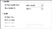
Change the appearance of data values using the Needle and Scale options, as shown in
Figure 4‑82.
Figure 4‑82 Formatting Flash gadget data values
You can display the needles and needle values at the top or the bottom of the gadget.
Dashboard developers can display scale values on the gadget. Set a limit on the displayed value by setting a minimum and maximum value to the Scale. For example, if the gadget is showing scale values up to 2000 but the actual value is less than 1000, you can set the maximum value of the scale to be 1200.

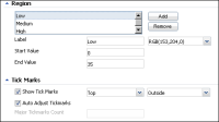
Change the appearance of the gadget using the Region and Tick Marks options, as shown in
Figure 4‑83.
Figure 4‑83 Formatting the region and tick marks
You can add colored regions to appear on the gadget by adding a region and assigning a start value, end value, and a color for the region.
Enabling auto adjust tick marks displays a calculated number of ticks. Disable auto adjust tick marks to display a fixed number of ticks.
You can select the colors and font used in the linear gadget. For more information about selecting colors, see
Using the color picker, earlier in this section.
Formatting a meter gadget
You can format a meter gadget to modify its appearance on a dashboard.
Figure 4‑84 shows the formatting elements you can modify.
Figure 4‑84 Displaying a meter gadget
Choose Edit from the gadget menu or create a new gadget to open Gadget Builder. In Gadget Builder, select Gadget Builder—Format to see formatting options. The following formatting options are available for a meter gadget:

Change the appearance of the gadget using the Flash Gadget options, as shown in
Figure 4‑85.
Figure 4‑85 Formatting Flash gadget options
The dashboard developer can change the dimensions of the Flash gadget and customize the gadget font attributes, such as font, size, and color.

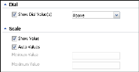
Change the appearance of data values using the Dial and Scale options, as shown in
Figure 4‑86.
Figure 4‑86 Formatting Flash gadget data values
Selecting Show dial value displays the needle values. You can display dial values above or below the meter.
Dashboard developers can display scale values on the gadget. Set a limit on the displayed value by setting a minimum and maximum value to the Scale. For example, if the gadget is showing scale values up to 2000 but the actual value is less than 1000, you can set the maximum value of the scale to be 1200.

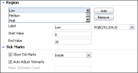
Change the appearance of the gadget using the Region and Tick Marks options.
You can add colored regions to appear on the gadget by adding a region and assigning a start value, end value, and a color for the region.
Enabling auto adjust tick marks displays a calculated number of ticks. Disable auto adjust tick marks to display a fixed number of ticks.
Figure 4‑87 shows these options.
Figure 4‑87 Formatting the region and tick marks
The dashboard developer can select colors for the font used and the regions in the meter gadget. For more information about selecting colors, see
Using the color picker, earlier in this section.
Formatting a sparkline gadget
You can format a sparkline gadget to modify its appearance on a dashboard.
Figure 4‑88 shows the formatting elements you can modify.
Figure 4‑88 Displaying a sparkline gadget
Choose Edit from the gadget menu or create a new gadget to open Gadget Builder. In Gadget Builder, select Gadget Builder—Format to see formatting options. The following formatting options are available for a sparkline gadget:

Change the appearance of the gadget using the Flash Gadget options, as shown in
Figure 4‑89.
Figure 4‑89 Formatting Flash gadget options
The dashboard developer can change the dimensions of the Flash gadget. You can customize the font attributes used in the gadget, such as font, size, and color.

Change the appearance of data values using the Plot and Value options, as shown in
Figure 4‑90.
Figure 4‑90 Formatting Flash gadget data values
Dashboard developers can display the open, close, high, and low plot values on the gadget. Set a limit on the displayed value by setting a minimum and maximum value in Value. For example, if the gadget is showing values up to 2000 but the actual value is less than 1000, you can set the maximum value to be 1200.
The dashboard developer can select a color for the font used in the sparkline gadget. For more information about selecting colors, see
Using the color picker, earlier in this section.
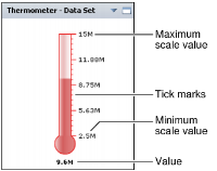
Formatting a thermometer gadget
You can format a thermometer gadget to modify its appearance on a dashboard.
Figure 4‑91 shows the formatting elements you can modify.
Figure 4‑91 Displaying a thermometer gadget
Choose Edit from the gadget menu or create a new gadget to open Gadget Builder. In Gadget Builder, select Gadget Builder—Format to see formatting options. The following formatting options are available for a thermometer gadget:

Change the appearance of the gadget using the Flash Gadget options, as shown in
Figure 4‑92.
Figure 4‑92 Formatting Flash gadget options
The dashboard developer can change the dimensions of the Flash gadget. You can customize the color of the displayed value and the font attributes used in the gadget, such as font, size, and color.

Change the appearance of data values using the Value and Scale options, as shown in
Figure 4‑93.
Figure 4‑93 Formatting Flash gadget data values
Dashboard developers can display value and scale values on the gadget. Set a limit on the displayed value by setting the Scale minimum and maximum value. For example, if the gadget is showing scale values up to 2000 but the actual value is less than 1000, you can set the maximum value of the scale to be 1200.

Change the appearance of the gadget using the Tick Marks options, as shown in
Figure 4‑94.
Figure 4‑94 Formatting the region and tick marks
Enabling auto adjust tick marks displays a calculated number of ticks. Disable auto adjust tick marks to display a fixed number of ticks.
The dashboard developers can select colors for the gadget and the font used in the thermometer gadget. For more information about selecting colors, see
Using the color picker, earlier in this section.
