How to create a Flex table gadget
This procedure requires a dashboard you can edit. Create a new dashboard if one does not already exist. To create a Flex table gadget, complete the following steps:
1 Display available gadgets by selecting Add Content and choosing New Gadget.
2 Choose the Data Visualization folder. If the folder is not visible, choose Home first.
3 Choose the right arrow in the New Gadget pane until you see Adobe Flex Table. Drag the Adobe Flex table gadget and drop it on the dashboard.
4 Specify desired gadget display options in Flex Builder—General:

Display the header, border, and scroll bar.

Gadget title.

Refresh rate.
5 To select the data to display in the Flex table gadget, complete the following steps:
1 In Flex Builder—Data—Use Data From, select a data source.
2 Select any fields to display when using tabular format.
3 Select dimension, attribute, and measure fields to display when using summary format.
6 Limit displayed data with filter conditions, if desired, in Flex Builder—Filter.
7 Format the Flex table gadget, if desired, in Flex Builder—Format.
8 Choose OK to create the new gadget.
Enable interactive filtering by linking the Flex table to a data selection gadget. After the Flex table is placed on the dashboard, it links to data selection gadgets that use the same data source. You can remove these links or add new ones.
Displaying data in a Flex table gadget
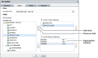
Adding this gadget to a dashboard or editing it, displays Flex Builder—Data, as shown in
Figure 4‑95.
Figure 4‑95 Assigning data to display in a Flex table gadget
A dashboard developer selects a data set from data objects on the dashboard, or adds a new data object from data objects available on the BIRT iHub. Filtering data sets occurs before the data appears in the gadget.
The dashboard developer assigns data to different parts of the Flex table. To select multiple values, press Ctrl as you select each value.
Flex table columns support the use of all data fields unless Summarize is selected. When Summarize is selected, the Flex table aggregates measures in the table. When fields are summarized, Current Column Selections only supports dimensions and attributes. Choose Summarize in Flex Builder—Data to enable a summary table.
Displaying a summary table requires both measures and dimensions from the data object. The table displays aggregations of the data set when summarize is selected.
Summary Flex tables can summarize measure values using the aggregation functions shown in
Table 4‑4.
Table 4‑4 Aggregate functions for a Flex table
Function | Description |
Average | Returns the average of the values |
Count | Returns the number of values, including duplicate values |
Max | Returns the largest value among the values |
Min | Returns the smallest value among the values |
Sum | Returns the sum of the values |
Dashboard developers can also limit the data that appears in the gadget by using Flex Builder—Filter to create filter conditions. For more information about filtering, see
Filtering a gadget data source, earlier in this section.
Formatting a Flex table gadget
You can format a Flex table gadget to modify its appearance on a dashboard.
Figure 4‑96 displays the elements of a Flex table gadget that you can modify.
Figure 4‑96 Displaying a Flex table gadget
Choose Edit from the gadget menu or create a new gadget to open Flex Builder. In Flex Builder, select Flex Builder—Format to see formatting options. The following formatting options are available for a Flex table gadget:

Customize the appearance of the table header using the Column Header options and the font attributes used in the header, such as alignment, color, font, and size. You can selected a color for the font and background, as shown in
Figure 4‑97.
Figure 4‑97 Formatting headers of a Flex table

Customize the appearance of the table rows using the Data Row options, as shown in
Figure 4‑98.
Figure 4‑98 Formatting the data row
The dashboard developer can set a color for every other row by selecting an alternating background color in Data Row. You can customize the font attributes used in the rows, such as color, font, and size.

Customize the border and grid displayed in the table using the General Properties options, as shown in
Figure 4‑99.
Figure 4‑99 Formatting the table border and grid
If you display a border and grid lines you can select a color to for them. You can select colors for the Column Header, the Data Row, and the General Properties of the Flex table gadget. For more information about selecting colors, see
Using the color picker, earlier in this section.


