Using a data selection gadget
Each data selection gadget has the following configuration options that are available by choosing Edit in the gadget menu:

Data options for assigning data to display in the gadget
Filter options to limit the displayed data in the gadget
Format options for each type of gadget
General options to set how the gadget appears on the dashboard
Type option to change the gadget type
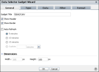
Figure 4‑106 shows Data Selector Gadget Wizard—General. Showing the header or border makes those parts of the gadget visible. Auto refresh sets a gadget to refresh at a set frequency.
Figure 4‑106 Choosing general options for a data selection gadget
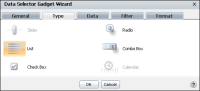
When adding or editing data selection gadgets, you can change the selection type displayed in Data Selector Gadget Wizard—Type, as shown in
Figure 4‑107.
Figure 4‑107 Choosing a data selection gadget type