About data selection gadgets
You filter data displayed in gadgets by choosing values in data selection gadgets (selectors), such as a list. Other gadgets link to data selection gadgets to filter their displayed data. For example, a selection gadget can be a list of customers. When a user selects a customer from the list, a linked report gadget can show data related to the selected customer.
Data selection gadgets can be linked to other data selection gadgets to present users with related choices. For example, a list gadget displaying customer order numbers is linked to a list gadget displaying customer names. When the user selects a customer name, the order numbers for the selected customer appear in the list gadget of order numbers. The following gadgets are available in the data selection category of gadgets:

Calendar gadget
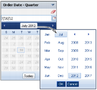
Users can select day, month, or year from a BIRT data object using calendar gadgets. Fast access to a month or year is available by selecting the month and year, as shown in
Figure 4‑32.
Figure 4‑32 Values in a calendar gadget

Check box gadget
Check box gadgets display data with a check box next to each value, as shown in
Figure 4‑33. This gadget supports multiple-value selections. Users can also clear the selected value.
Figure 4‑33 Values in a check box gadget

Combo box gadget
Combo box gadgets display data in a drop-down list, as shown in
Figure 4‑34. This gadget supports typing of values, using auto-suggest functionality, and selecting from a list of values.
Figure 4‑34 Values in a combo box gadget with auto‑suggest

Data version gadget
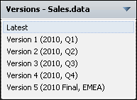
This gadget enables you to select the data object store version to display on the dashboard. Other gadgets on the dashboard that use the same data object store display the version selected by the user. Users can select the most current data object store by choosing Latest from the list of available versions.
Figure 4‑35 displays different versions of the data object store that a user can select.
Figure 4‑35 Versions of a data store displayed for user selection

List gadget
List gadgets display data in rows, as shown in
Figure 4‑36. This gadget supports multiple-value selections and searching list items. Press the Ctrl key while selecting separate values; press Shift key while selecting a range of values. You can also clear the selected value.
Figure 4‑36 Values in a list gadget

Radio button gadget
Radio button gadgets display data with a radio button next to each value, as shown in
Figure 4‑37. This gadget supports single-value selections.
Figure 4‑37 Values in a radio gadget

Selector group gadget
Selector group gadgets display values in a cascade. You can pick from lists of related values. When the user chooses apply, linked gadgets on the dashboard update to display data related to the all user selections in the data selector gadget.
Figure 4‑38 shows a slider gadget.
Figure 4‑38 Values in a selector group gadget

Slider gadget
Slider gadgets display data as a sliding bar with tick marks next to known values. You can slide one or two thumbs along the slider to select values. When two thumbs are displayed, the value between the two thumbs is used to select data.
Figure 4‑39 shows a slider gadget.
Figure 4‑39 Report parameters in a slider gadget


