Using a dial
A dial indicator displays data values using a needle that points to data values and range boundaries appearing on a semi-circular dial. To compare values with defined bounds, define data measures, values, and properties for a dial using the following features on Definition:

Measure: Add, edit, duplicate, or delete measures and formulas.
Values: Assign maximum, mean, and minimum values to a dial by selecting an appropriate measure. To indicate multiple values, use Add dial to create a new needle, then set alias, color, and size properties for each new needle.
Properties: Choose values to appear as boundaries for defined ranges, and assign a unique color or shade to each range.
You can covert a dial into a meter, sphere, or cylinder indicator.
How to create measures to display on a dial indicator
1 In Gallery—Dial, choose Definition.
2 To create a measure for the dial, choose New measure.
3 In Alias, type a name for the new measure.
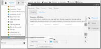
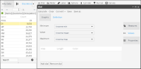
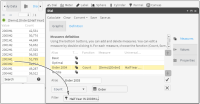
4 Select Maximum as the function for the new measure. From My Data, drag a column on which to base the measure and drop it next to Maximum, as shown in
Figure 5‑1.
Figure 5‑1 Defining a new measure for a dial
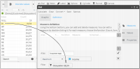
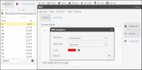
5 To create a filter, double‑click a column in My Data. Drag a field from Discrete Values and drop it in Filter, as shown in
Figure 5‑2.
Figure 5‑2 Adding a filter to a measure
6 Choose the check mark to create the new measure.
7 To create another measure with properties similar to the first, select a measure and choose Duplicate.
8 Type a name and change the function to Minimum, as shown in
Figure 5‑3.
Figure 5‑3 Creating a new measure based on a measure having similar properties
9 Choose the check mark to create the new measure.
10 Repeat steps
7–
9, changing the function to Mean.
How to add formulas and thresholds to a dial indicator
1 Choose New formula to create a formula.
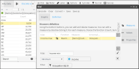
2 In Alias, type a name for the formula, and type a formula for a lower threshold in the dialog box below Alias. In this example, the formula is a value.
3 Choose Validate. At the message that the formula definition is valid, shown in
Figure 5‑4, choose OK.
Figure 5‑4 Validating the definition for a formula
4 To create the new formula, choose the check mark.
5 Repeat steps
12–
4, entering a formula for a higher threshold.
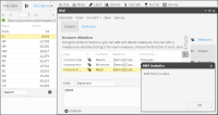
6 Choose Values.
7 For each value appearing on the dial, choose an appropriate measure from the list. For example, choose measures that correspond to minimum, mean, and maximum values, as shown in
Figure 5‑5.
Figure 5‑5 Assigning measures to values that appear on a dial
How to add properties to the dial indicator
1 Choose Properties.
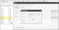
2 Choose Add range.
3 Choose a measure or formula to indicate the minimum and maximum thresholds for the range, as shown in
Figure 5‑6.
4 In Color, open the palette and select a color for the range. Choose OK.
Figure 5‑6 Configuring properties for a dial
5 Repeat steps
2–
4 until you have created three ranges.
6 Choose OK.
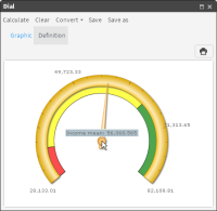
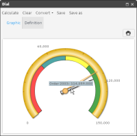
7 Choose Calculate to view the dial. To see the average value, hover the cursor over the needle, as shown in
Figure 5‑7.
Figure 5‑7 Viewing the value of an average on a dial
How to configure a dial so that min, max, and average values for two similar groups appear
1 In Data Tree, choose My folders.
2 Locate and open a previously saved dial. Choose Calculate. The dial appears on Graphic, as shown in
Figure 5‑8.
Figure 5‑8 Calculating results for a dial
3 Choose Definition.
4 Select a measure and choose Duplicate.
5 In Alias, type a name, then replace the filter. To replace a filter, drag a segment, drop it in Filter, as shown in
Figure 5‑9, then choose Replace.
Figure 5‑9 Replacing the filter in a duplicated measure
6 Choose the check mark to create the new measure.
7 Choose Values.
8 Choose Add dial.
9 In Alias, select the measure shown to open a pull‑down menu and choose the newly created measure, as shown in
Figure 5‑10.
Figure 5‑10 Adding a new measure to a dial
10 In Color, open the palette and select a color for the range. Choose OK.
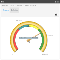
11 Choose Calculate to view the dial. The dial now represents two similar groups. Hover the cursor over each needle to see and compare values represented by each needle, as shown in
Figure 5‑11.
Figure 5‑11 Viewing a dial representing values from two similar groups