Designing data objects for dashboards
A dashboard is a web application designed for business users who want to measure the effectiveness of their business processes and have this decision‑support information displayed graphically. The data objects you create for dashboards need to extract the right data and provide it in a structure suitable for dashboard gadgets.
Use the following guidelines when designing data objects for dashboard users:

Identify the users and create a data object or series of data objects for each user group.
A typical approach is to create data objects by groups of users, where each data object fulfills a different business need. For example, executives, sales managers, and customer support managers represent three distinct user groups with different data requirements. Executives might be interested in viewing revenue by month or quarter. Sales managers might need to evaluate the sales numbers of individual sales representatives by month or quarter. Customer support managers might need to monitor support call volume by days. Depending on how iHub user accounts are set up, you might be able to leverage the defined user groups to identify the user groups by which to organize data objects. Contact the iHub administrator for this information.
Provide users with sufficient data that they can use to analyze by different dimensions and at different levels of detail.
Users often need to view data from different dimensions. For example, sales managers might need to view sales by product line, by region, or by sales representative, and by different time periods. If viewing sales data by region, sales managers might need to drill down to view sales by cities within each region.
Design data sets, data models, and cubes to provide data that is suitable for the gadgets that will be used to display data.
The dashboard provides a suite of gadgets for displaying data. Each gadget accesses data in the same way as the corresponding element does in a BIRT report.
All chart gadgets use data from a data set, a data model, or a cube.
The crosstab gadget uses data from a data model or cube.
The table and summary table gadgets use data from a data set or a data model. In addition, summary tables require that each column in the data set be assigned the appropriate analysis type to provide the expected functionality. For more information, see
“Configuring data set columns for summary tables,” later in this chapter.
Design data sets or report parameters to provide lists of values to display in data selector gadgets. Just as a report parameter supports run‑time filtering of data in a report, a data selector gadget enables a dashboard user to filter data in a chart, crosstab, table, or any other gadget that displays data.
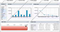
Figure 10‑1 shows a dashboard that uses five gadgets to display sales data. Descriptions of each gadget follow the illustration.
Figure 10‑1 Sample dashboard displaying five gadgets
The data selector gadget displays a list of countries. The data selector is linked to the column chart next to it. Dashboard users select values from the data selector to filter the data to display in the column chart. The data selector gets its values from a data set, a data model, a cube, or a report parameter.
The column chart gadget is linked to the data selector, as described previously. The column chart derives its data from a data set, a data model, or a cube.
The line chart gadget derives its data from a data set, a data model, or a cube.
The linear gauge gadget derives its data from a data set, a data model, or a cube.
The crosstab gadget derives its data from a data model or a cube.