A sphere displays data graphically using a round, three‑dimensional shape that changes color based on the limit area of the value it represents. The following tabs are in Definition:
Measure: Use the buttons to add or delete measures and formulas. To edit an existing measure, double-click it.
Values: Type the maximum and minimum values and the value to represent by the measures.
Properties: Select the values to use as the limits of the areas to be represented. Choose the color.
You can convert a sphere into a dial, meter, or cylinder indicator.
How to add measures to a new sphere
1 In Gallery—Sphere, choose Definition.
2 Choose New measure.
3 Type a name for the new measure.
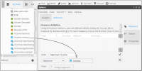
4 Select a function for the sphere. From Data Tree, drag a column on which to base the measure, as shown in Figure 5‑28.
Figure 5‑28 Defining a measure for a sphere
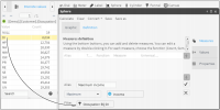
5 To create a filter, double‑click one of the columns in Data Tree. In Discrete Values, drag a field and drop it in Filter, as shown in Figure 5‑29.
Figure 5‑29 Adding a filter to a measure
6 To create the measure, choose the check mark.
7 To create another measure having properties similar to an existing one, select a measure and choose Duplicate.
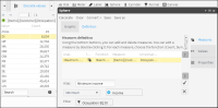
8 Type a measure name and change the function to Minimum, as shown in Figure 5‑30.
Figure 5‑30 Creating a new measure having properties similar to an existing measure
9 To create the new measure, choose the check mark.
10 Repeat steps 7–9, changing the function to Mean.
How to add a formula to a sphere
1 Choose New formula.
2 Type a name for the formula, and select a formula for a lower threshold in the dialog box below.
3 Choose Validate to ensure the function is valid. Choose OK.
4 To create the new function, choose the check mark.
5 Repeat steps 1–4, entering a formula for a higher threshold.
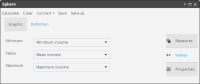
How to create ranges to display in a sphere
1 Choose Values.
2 Using the pull‑down menus, select measures to indicate minimum, average, and maximum values to use in the sphere, as shown in Figure 5‑31.
Figure 5‑31 Assigning measures to values that appear in a sphere
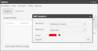
3 Choose Properties.
4 Choose Add range.
5 Using the pull‑down menus, select measures to indicate a minimum and maximum value to use, as shown in Figure 5‑32.
6 In Color, use the palette to apply a color to each range you create.
Figure 5‑32 Configuring properties for a sphere
7 Repeat steps 4–6, until you create three ranges.
8 Choose OK.
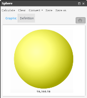
9 Choose Calculate. The sphere appears on Graphic, as shown in Figure 5‑33.
Figure 5‑33 Visualizing a data measure using a sphere