Using a selector group gadget
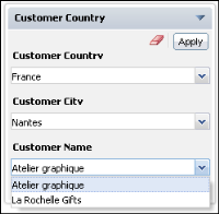
Selector group gadgets display values in a cascade. Users pick from related values and apply them when all selections are finished. When the user chooses apply, linked gadgets on the dashboard update to display data related to the user selection. The dashboard developer chooses formatting for the values and features to enable, such as value search and multiple selection.
Selecting a data object
Selector group gadgets display multiple data fields and provide users with cascading choices. Use this option to display related values and enable users to finish all selections before updating linked gadgets.
Figure 4‑132 shows the additional data options for a selector group gadget.
Figure 4‑132 Assigning data to a selector group gadget
Select one or more data fields to display together. Each data field can be sorted and formatted differently. Each data field will filter the data fields below it. For example, if the first data field is country and the second is city, the gadget displays countries for a user to select. Each selected country displays city names from the selected countries.
Choosing a selector type
You can display selector group gadgets in a combo box or list. Use the Data Selector Gadget Wizard—Type options to change how the selector group gadget is displayed, as shown in
Figure 4‑133.
Figure 4‑133 Displaying selectors types
Figure 4‑134 shows a selector group gadget displaying lists of values from a BIRT data object. The list type supports searching values and multiple selection.
Figure 4‑134 Displaying a selector group in horizontal lists
Figure 4‑135 shows a selector group using vertical combo boxes to display values from a BIRT data object.
Figure 4‑135 Displaying a selector group using combo boxes vertically
Formatting a selector group gadget
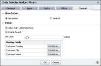
The dashboard developer can use Data Selector Gadget Wizard—Format to format the content of the gadget, as shown in
Figure 4‑136.
Figure 4‑136 Formatting a selector group gadget using the list type
The dashboard developer can enable a horizontal or vertical display, multiple selections, and value search. The developer can also limit the quantity of values to display in the gadget and format each display field. For example, all country names could display in capital letters.
For more information about formatting options, see
“Formatting data selection gadgets,” earlier in this section.


